---
title: "Bioprocess Optimization"
output:
rmarkdown::html_vignette:
self_contained: FALSE
vignette: >
%\VignetteIndexEntry{Bioprocess Optimization}
%\VignetteEngine{knitr::knitr}
%\VignetteEncoding{UTF-8}
editor_options:
markdown:
wrap: 72
---
```{r, include = FALSE}
knitr::opts_chunk$set(
echo = TRUE,
#eval = FALSE,
#collapse = TRUE,
comment = "#>"
)
```
## Overview
In this article, a dataset originating from the biotechnological
industry will be analyzed. It was originally published with the book
[Applied Predictive Modeling](http://appliedpredictivemodeling.com/).
The goal of the study, during which the data was generated, was to
maximize the process yield. To achieve this, 57 different process
variables were varied. In total, 176 processes were performed. All
variables except the features were masked. Our aim is to explore the
data and visualize what influence the process parameters had on the
yield.
## Preparing the data
At first we want to load the ChemicalManufacturingProcess data set (originally from the AppliedPredictiveModeling package) and transform it into a data.table. We also give the process
variables shorter names, so that the interactive plots that will be
generated alter are easier to read.
```{r loading data}
library(lionfish)
library(data.table)
data(ChemicalManufacturingProcess)
data <- data.table(ChemicalManufacturingProcess)
col_names <- names(data)
mp_cols <- grep("^ManufacturingProcess", col_names, value = TRUE)
bm_cols <- grep("^BiologicalMaterial", col_names, value = TRUE)
new_mp_names <- sub("^ManufacturingProcess", "ManPr", mp_cols)
new_bm_names <- sub("^BiologicalMaterial", "BioMat", bm_cols)
setnames(data, old = mp_cols, new = new_mp_names)
setnames(data, old = bm_cols, new = new_bm_names)
```
Since the data contains many NA's we need to clean it before we can
start the analysis. At first we remove all rows with \>3 NA's, then all
columns with \>3 NA's, then we remove datapoints with extreme outliers,
and finally we remove columns which still contain NA's.
```{r removing incomplete entries}
data <- data[rowSums(is.na(data))<3]
data <- data[, lapply(.SD, function(x) if (sum(is.na(x)) <= 3) x else NULL)]
data <- data[-c(99,153,154,158,159,160)]
data <- data[, lapply(.SD, function(x) if (sum(is.na(x)) <= 0) x else NULL)]
```
Then we want to visualize the distribution of yield. Therefore, we first
categorize them into 10 groups depending on their yield, and the
visualize them with a histogram. We also store the labels of the groups
for later use.
```{r}
min_yield <- min(data$Yield, na.rm = TRUE)
max_yield <- max(data$Yield, na.rm = TRUE)
intervals <- seq(min_yield, max_yield, length.out = 11)
yield_values <- findInterval(data$Yield, intervals, rightmost.closed = TRUE)
yield_labels <- paste0("Yield ", head(intervals, -1), "-", tail(intervals, -1))
```
```{r, eval = FALSE}
library(ggplot2)
library(viridis)
yield_values_factor <- factor(yield_values, labels = yield_labels)
ggplot(data, aes(x = Yield, fill = yield_values_factor)) +
geom_histogram(binwidth = (max_yield - min_yield) / 30, color = "black") +
scale_fill_viridis(option = "plasma", discrete = TRUE) +
theme_minimal() +
labs(title = "Histogram of the process yield",
x = "Yield",
y = "Count",
fill = "Yield Intervals")
```
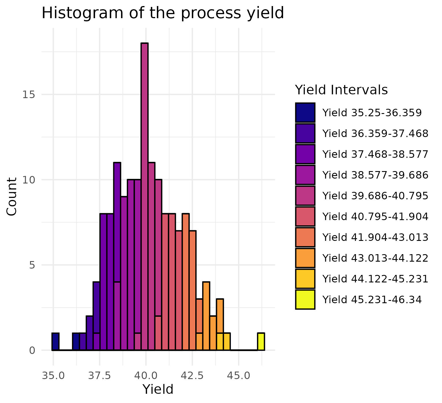{width=100%}
Finally, we standardize the data and remove the yield.
```{r}
data <- data[, lapply(.SD, function(x) (x - mean(x, na.rm = TRUE)) / sd(x, na.rm = TRUE))]
data_wo_y <- copy(data)
data_wo_y[, Yield := NULL]
```
## Visualizing the full dataset
Now that we prepared the data, we can visualize it with lionfish.
Therefore, we at first initialize the python backend with init_env(),
and then generate two tour history objects with the tourr package. Both
tours use the linear discriminant analysis projection pursuit index,
which aims to maximize the separation between the 10 different yield
groups. One tour history object projects into 1D and while the other one
projects into 2D. Next, we estimate an appropriate initial value for the
half range of our display. The half range acts as a scaling factor,
determining the extent to which the data is spread out in the graphical
interface. In this instance, the initial estimate caused the data points
to appear too close together. To improve the visualization, we reduced
the half range by half, resulting in a more effective display of the
data. Then, the plot objects have been defined. Plot objects are named
lists that specify the type of the display to be shown and some display
specific additional information. In our case we want to display a
"1d_tour" and a "2d_tour" and give the objects our previously generated
tour histories.
```{r}
set.seed(42)
library(tourr)
display_size <- 5 # Adjust to fit your display
```
```{r}
if (check_venv()){
init_env(env_name = "r-lionfish", virtual_env = "virtual_env")
} else if (check_conda_env()){
init_env(env_name = "r-lionfish", virtual_env = "anaconda")
}
```
```{r, results="hide", message=FALSE}
lda_tour_history_1d <- save_history(data_wo_y,
tour_path = guided_tour(lda_pp(yield_values),d=1))
lda_tour_history_2d <- save_history(data_wo_y,
tour_path = guided_tour(lda_pp(yield_values),d=2))
half_range <- max(sqrt(rowSums(data_wo_y^2)))
feature_names <- colnames(data_wo_y)
obj1 <- list(type="1d_tour", obj=lda_tour_history_1d)
obj2 <- list(type="2d_tour", obj=lda_tour_history_2d)
```
Finally, we start an interactive tour to have a closer look at the data.
```{r}
if (interactive()){
interactive_tour(data=data_wo_y,
plot_objects=list(obj2),
feature_names=feature_names,
half_range=half_range/2,
n_plot_cols=2,
preselection=yield_values,
preselection_names=yield_labels,
display_size=8,
color_scale="plasma")
}
```
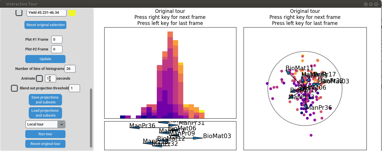
First, we set the "Blend out projection threshold" to 0.2. This setting
causes projection axes with a norm of less than 0.2 to be blended out,
which helps to reduce clutter in the plot. Next, we set the time
interval next to "Animate" to 0.1 seconds. This adjustment causes the
plots to move to the next projection of the tour objects every 0.1
seconds (note that the animation speed may be slightly slower depending
on the rendering time of each frame). Noticeable separation between the
yield groups begins to occur around frame 10 and becomes even more
pronounced from frame 30 onward. We successfully identified projections
that explain the differences in yield
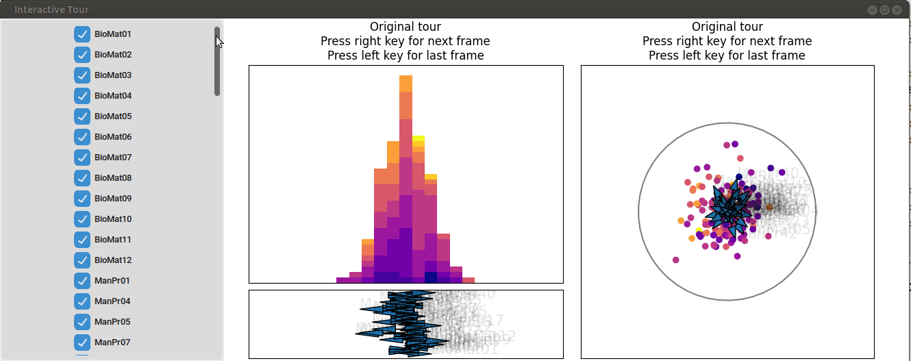{width=100%}
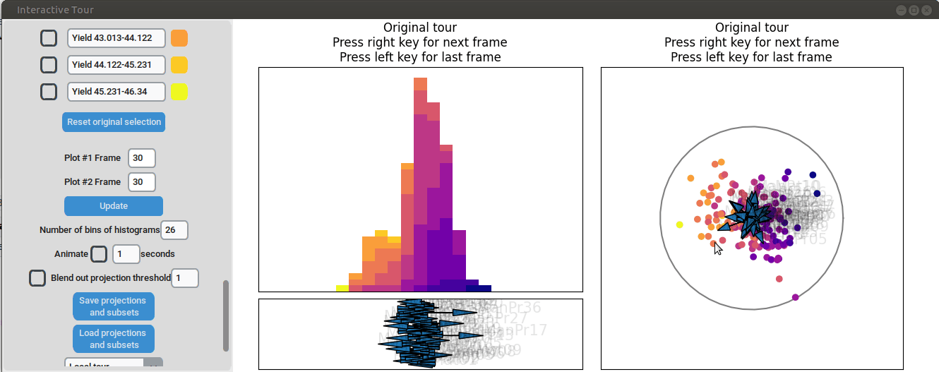
Let's investigate the projections further. Projection axes that point
towards the high yield groups have a large positive influence on them,
whereas projection axes that point away from them have a negative
influence on the yield. To better understand their influence, we can
move the mouse cursor to the arrowheads to see which original process
parameter each axis represents. We can also change the axes by dragging
and dropping the arrowhead with the right mouse button.
When we adjust the longest projection axis to point towards the high
yield groups, we first observe that the axis arrow represents
manufacturing process 09 (ManPr09). Extending it further in the
direction of the high yield groups leads to greater separation, while
dragging it in the opposite direction results in worse separation. This
suggests that high values of manufacturing process 09 are associated
with higher yields.
However, by changing the axis to point in the opposite direction, we
notice that the groups start to mix. This indicates that the variable
manufacturing process 09 alone is not sufficient to explain the yield.
If it were, then changing the direction of manufacturing process 09
would simply invert the data, and we would still see the high yield
groups aligned with the manufacturing process 09 axis.
{width=100%}
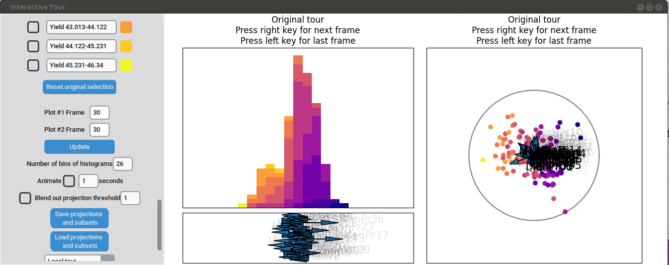
We can now adjust some of the other axes to see if we can identify
interactions between the parameters. For instance, when we elongate the
axis representing manufacturing process 32, we observe a positive
interaction between the two variables. To confirm their influence, we
can drag both axes in the opposite direction. Unlike changing only
manufacturing process 32, this action somewhat inverts the data. This
indicates that these two variables together already explain the yield
quite well. But since the separation isn't as clear as with the original
projection and we see that the high yield groups aren't exactly in the
direction of the two axes, we still need more variables to fully explain
the influence on the yield.
{width=100%}
Furthermore, we can vary some of the other process parameters to capture
more interactions or potential structural patterns. For instance, by
adjusting the axis representing manufacturing process 31, we observe an
outlier with a low value for that parameter (the data point is in the
opposite direction of the axis) that had a slightly above-average yield.
{width=100%}
Varying manufacturing process 40 results in two clearly separated
groups. This indicates that this variable had two discrete settings.
There is no clear indication that the variable had a strong influence on
the yield as we can see both high and low yield data points in both
groups.
{width=100%}
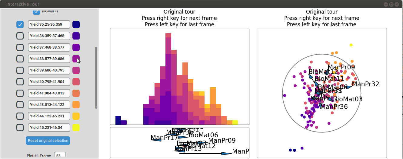
## Feature preselection with random forests
Now that we got a first overview of the data, we can refine our
visualization by fitting a random forest model, that predicts the yield
based on the other process variables, and selecting only the the most
important variables according to the model. For this analysis the 10
most important have been chosen.
```{r,results = 'hide', warning=FALSE, message=FALSE}
if (requireNamespace("randomForest")) {
set.seed(42)
library(randomForest)
}
```
```{r}
if (requireNamespace("randomForest")) {
rf <- randomForest(Yield~.,data)
importance_df <- data.frame(rf$importance)
importance_df <- as.data.table(rf$importance, keep.rownames = "Feature")
sorted_importance <- importance_df[order(-IncNodePurity)]
top_10_features <- sorted_importance[1:10, Feature]
print(top_10_features)
}
```
We can take from the R output that the 10 most important process
parameters according to the random forest model are manufacturing
processes 09, 13, 17, 31, 32, and 36, and biological materials 03, 06,
11 and 12. As a next step we reduce the dataset to only contain these
variables and visualize the data in the same way we did earlier.
```{r,results = 'hide', warning=FALSE, message=FALSE}
if (requireNamespace("randomForest")) {
data_rf_sel <- data[, ..top_10_features]
grand_tour_history_1d <- save_history(data_rf_sel,
tour_path = guided_tour(lda_pp(yield_values),d=1))
lda_tour_history_2d <- save_history(data_rf_sel,
tour_path = guided_tour(lda_pp(yield_values),d=2))
half_range <- max(sqrt(rowSums(data_rf_sel^2)))
feature_names <- colnames(data_rf_sel)
obj1 <- list(type="1d_tour", obj=grand_tour_history_1d)
obj2 <- list(type="2d_tour", obj=lda_tour_history_2d)
}
```
```{r}
if (interactive()){
interactive_tour(data=data_rf_sel,
plot_objects=list(obj1,obj2),
feature_names=feature_names,
half_range=half_range/2,
n_plot_cols=2,
preselection=yield_values,
preselection_names=yield_labels,
n_subsets=11,
display_size=8,
color_scale = "plasma")
}
```
We can see that there is already some separation at the initial frame,
and we can still achieve good separation between yield groups. The
extreme groups are even better separated compared to the projection with
all process parameters. At the final frame, we observe that
manufacturing processes 09 and 32, as well as biological material 12,
have a positive influence on the yield, while manufacturing processes 17
and 36 have a negative influence.
{width=100%}
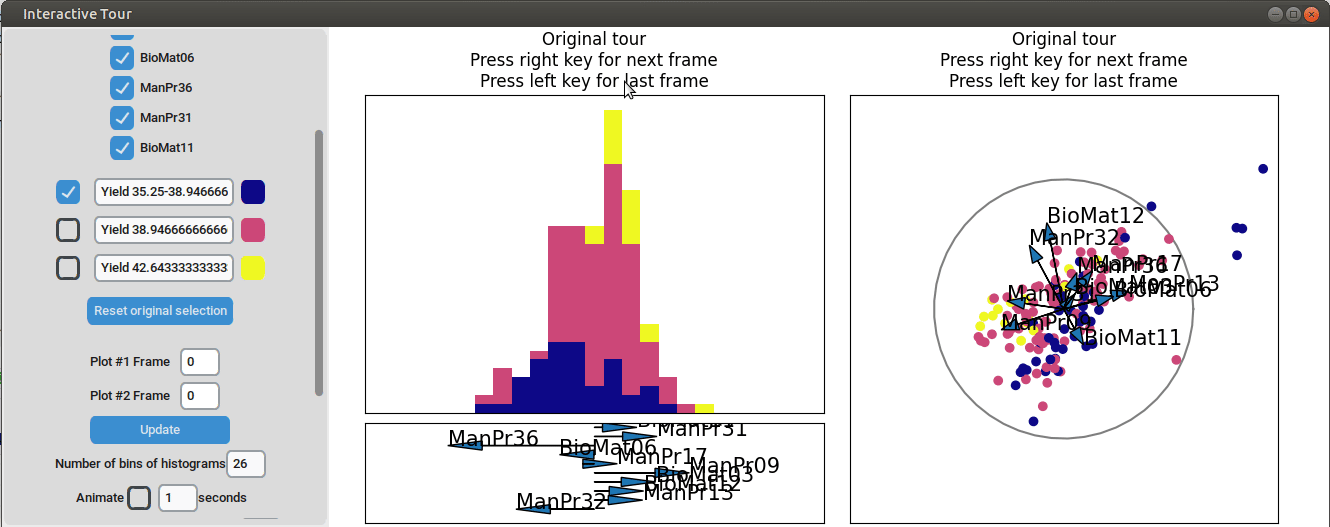
We may be interested in enhancing the separation between groups with particularly low and high yields. A quick method to achieve this is by adjusting the opacity of the groups we are less interested in, and then initializing a local tour to search for projections that better separate the highlighted groups.
{width=100%}
In the final frame, we observe that the separation between the extreme groups has improved slightly. Once we identify an interesting frame, we can save it by pressing "Save projections and subsets." This allows us to continue our analysis later. To reload the saved data, we can use the GUI by pressing "Load projections and subsets" and selecting the appropriate folder, or we can load it using the function load_interactive_tour().
A more elegant way of doing this would be to define only three yield bins and run another guided tour.
```{r}
intervals <- seq(min_yield, max_yield, length.out = 4)
new_yield_labels <- paste0("Yield ", head(intervals, -1), "-", tail(intervals, -1))
new_min_yield <- min(data$Yield, na.rm = TRUE)
new_max_yield <- max(data$Yield, na.rm = TRUE)
new_intervals <- seq(new_min_yield, new_max_yield, length.out = 4)
new_yield_values <- findInterval(data$Yield, new_intervals, rightmost.closed = TRUE)
```
```{r,results = 'hide', warning=FALSE, message=FALSE}
if (requireNamespace("randomForest")) {
grand_tour_history_1d <- save_history(data_rf_sel,
tour_path = guided_tour(lda_pp(new_yield_values),d=1))
lda_tour_history_2d <- save_history(data_rf_sel,
tour_path = guided_tour(lda_pp(new_yield_values),d=2))
half_range <- max(sqrt(rowSums(data_rf_sel^2)))
feature_names <- colnames(data_rf_sel)
obj1 <- list(type="1d_tour", obj=grand_tour_history_1d)
obj2 <- list(type="2d_tour", obj=lda_tour_history_2d)
}
```
```{r}
if (interactive()){
interactive_tour(data=data_rf_sel,
plot_objects=list(obj1,obj2),
feature_names=feature_names,
half_range=half_range/2,
n_plot_cols=2,
preselection=new_yield_values,
preselection_names=new_yield_labels,
n_subsets=3,
display_size=8,
color_scale = "plasma")
}
```
{width=100%}
We can see that this results in an even better separation. Again, we can run a local tour to see if we can further improve separation or observe another interesting angle. In case we still wouldn't be happy with the projections, we could run another guided tour - LDA from within the interface (not shown here).
## Conclusion
The shown analysis highlights how the lionfish package can be used to gain a quick overview on a complex dataset. We could identify what parameters had an influence on the process yield and whether the influence was positive or negative. Additionally, it was showcased how structures within the data can quickly be found with the interactive displays.