Project Gutenberg's Paint & Colour Mixing, by Arthur Seymour Jennings

This eBook is for the use of anyone anywhere in the United States and most
other parts of the world at no cost and with almost no restrictions
whatsoever.  You may copy it, give it away or re-use it under the terms of
the Project Gutenberg License included with this eBook or online at
www.gutenberg.org.  If you are not located in the United States, you'll have
to check the laws of the country where you are located before using this ebook.


Title: Paint & Colour Mixing
       A practical handbook for painters, decorators and all
              who have to mix colours, containing 72 samples of paint of
              various colours, including the principal graining grounds

Author: Arthur Seymour Jennings

Release Date: March 14, 2018 [EBook #56738]

Language: English

Character set encoding: ISO-8859-1

*** START OF THIS PROJECT GUTENBERG EBOOK PAINT & COLOUR MIXING ***


Produced by Chris Curnow, Harry Lamé and the Online
Distributed Proofreading Team at http://www.pgdp.net (This
file was produced from images generously made available
by The Internet Archive)
Please see the Transcriber’s Notes at the end of this text.


Gold Medals: Paris, 1878 and 1900.
Manufacturers of the Celebrated “Non=Poisonous Colours” in rich and delicate neutral tints, for High=Class Decorations.
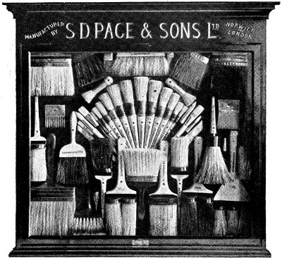
DON’T SPOIL YOUR WORK BY USING INFERIOR BRUSHES.
“PAGE’S”
PAINTING
BRUSHES
Have stood THE TEST OF A CENTURY, and every brush
bearing their name is acknowledged to be of the
BEST QUALITY that can be produced.
S. D. PAGE & SONS, LTD.,
NORWICH.
Illustrated Price List Post Free on application.
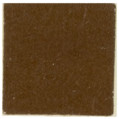
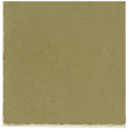
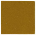
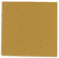
| COLOURS. | PURE. | WITH 25 PARTS ZINC. |
WITH 100 PARTS ZINC. |
|---|---|---|---|
| TURKEY UMBER |
 |
 |
 |
| FRENCH OCHRE |
 |
 |
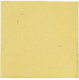 |
| RAW SIENNA |
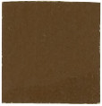 |
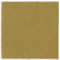 |
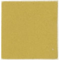 |
| ORANGE CHROME |
 |
 |
 |
| PRUSSIAN BLUE |
 |
 |
 |
| MEDIUM CHROME |
 |
 |
 |
| MIDDLE CHROME GREEN |
 |
 |
 |
| MOSS GREEN |
 |
 |
 |
A PRACTICAL HANDBOOK FOR PAINTERS, DECORATORS AND ALL WHO
HAVE TO MIX COLOURS, CONTAINING 72 SAMPLES OF PAINT OF
VARIOUS COLOURS, INCLUDING THE PRINCIPAL GRAINING GROUNDS,
AND UPWARDS OF 400 DIFFERENT COLOUR MIXTURES, WITH HINTS
ON COLOUR AND PAINT MIXING GENERALLY, TESTING COLOURS,
RECIPES FOR SPECIAL PAINTS, ETC., ETC.,
ARTHUR SEYMOUR JENNINGS.
London:
E. & F. N. SPON, Ltd., 125, STRAND.
NEW YORK:
SPON & CHAMBERLAIN, 123, LIBERTY STREET
1902.
[3]
The author would for some reasons be inclined to offer an apology for this work in its present form, because it falls so far short of what might be expected in a comprehensive treatise on the subject of which it treats. To understand colour mixing the student should first carefully study colour theory, and then the properties of pigments. But it will be observed that there is but little relating to theory in this work, and the reasons are given distinctly, and are, in brief, that the subject is too complex a one to render it possible for it to be dealt with in the limited range of these pages, while another reason is that the subject is very well covered in several books published in late years by Professor Church, George H. Hurst, Professor Rood, and others.
The author, however, has ample justification for the publication of this little work in the fact that he has during the last fifteen years received, in his capacity as editor of painters’ publications, enquiries almost daily for a book giving colour mixtures, with actual samples of colours, in other words, one which would be useful to the man who wants to mix paints but who has not made a study of the subject.
A critic might object that it is impossible to give accurate colour mixtures, because the actual appearance of colour varies according to the light in which it is viewed, and also because the result obtained by mixing coloured pigments of different manufacture[4] must vary greatly according to the quality of those colours. All these objections have been carefully borne in mind in the preparation of the contents of this work. It has been assumed that the colour mixtures will be viewed in an average good light, and it is further assumed that the colours which have been employed will not necessarily be of the very best quality but certainly not those which are very inferior. The chapters on colour testing, etc., have been added not only because these properly form a part of the subject, but because so many painters are deficient in a knowledge of them.
It need only be added that every one of the mixtures given in this work has been carefully made with the actual colours. The preparation of the list has been no inconsiderable work. The author therefore leaves his little book in the hands of practical readers in the hope that even if it falls short of being a complete treatise it may, at least, prove of some service in everyday work.
[5]
The Composition of a Paint—Pigments, Oil, Turpentine, Driers, Colours—Practical Paint Mixing, Mechanical Paint Mixer—Paint Strainer—The Proportions of Materials for use on Pine and Soft Woods—On Hard Woods generally—On Iron—On Stucco—On Plaster, etc.
Colours or Stainers—The appearance in strong and subdued lights—The Nomenclature of Colours—Examples of variation in the names of Colours—Efforts made to establish a Uniform Nomenclature—The Economy of using Good Colours—Hues, Shades and Tints.
Whites—Recipes for various mixtures of White Pigments—The Advantages and Disadvantages of White Lead, Zinc White, Lithopone, etc., etc.
Grays and Greys—General Remarks—How to Mix various Greys and Grays.
Reds, Crimsons and Purples—General Remarks—How to Mix these Colours.
Blues—General Remarks—How to Mix Blue generally.
Yellows—General Remarks—How to Mix Yellows generally.
Greens, how to Mix them—General Remarks—Suggestions for Experiments.
[6]
Browns, and how to Mix them—General Remarks on Browns.
Graining Grounds and how to Mix them.
How to Test the Quality of Colours—The Characteristics of Good Colours—Greens, Venetian, Tuscan and Indian Reds—Red Lead—Chromes—Ochres—Blacks—Blues—Umbers and Siennas.
Recipes, Tables, Hints and Notes—List of Books useful to the Painter.

[7]
—Clearly the first thing to be done before studying the subject of paint and colour mixing is to determine what a paint or what a colour is. Without attempting to give a hard and fast definition, it may be said that a paint consists of any pigment, such as white lead, mixed with linseed oil, and thinned by means of turpentine to render it in such a condition that it may be readily applied to the surface of wood, iron and other work by means of a brush. Paint serves the purpose first of preserving the material to which it is applied, and secondly, but not always, a decorative object where the colour is of importance.
The principal pigment used in paint mixing is white lead, but there are many others that are also employed. Many painters look upon paint as necessarily consisting of white lead to which has been added sufficient colouring matter to give the desired tint. As a matter of fact, white lead may be wholly absent from a paint. For example, yellow ochre may be used by itself; iron oxide in the shape of Indian red, purple brown, Venetian red, or Tuscan red forms in itself a good paint if the colour is not objectionable. Again, in the lighter paints we sometimes have white lead replaced by an admixture of zinc white, barytes and other materials of the kind.
The oil used in mixing paint is used to combine the particles or pigment together. That is its chief object, but it is also employed to give a glossy surface and to bring the material to a proper consistency. Turpentine could be used for the latter purpose by itself, but the result would be what is termed a “flat” surface, or an absence of gloss. The turpentine, too, evaporates to a considerable extent. It is generally conceded, among those who have given close attention to the subject, that the durability of a paint depends[8] largely upon the oil used; indeed, it has been likened to the life-blood of the paint. There is not much doubt that the best pigments may be replaced with others somewhat inferior without so much detriment to the quality of the paint as if linseed oil is replaced by some other oil. It is quite necessary that pure linseed oil be used in the manufacture of all paints, and although there are one or two substitutes on the market which may be employed in very cheap work, no attempt should be made to execute a really good job unless pure linseed oil is used. The purpose of the oil in giving a gloss is sometimes assisted by the addition of a small quantity of oak varnish. This is a growing custom among painters, as the gloss produced is decidedly improved by the addition of the varnish and the work shows up well, while the varnish does not in any way detract from the life of the paint, but rather adds to it. This practice is employed more on inside than outside work, where the execution of the painting requires more care than it does inside, owing to the severe atmospheric conditions, which cause any paint work not properly prepared to soon decay.
The base, such as white lead, having been selected, colours are mixed in order to produce the desired hue or tint. Frequently, however, a colour is made by the mixture of several other colours without any white lead at all. A careful examination of the list included in this book will make this clear.
The colour having been determined, oil, turpentine, and driers are then added. The object of the driers is that of causing the paint material to dry quickly. There are several kinds of driers on the market, but the two best known are termed “patent driers,” which is sold in solid form, and the “liquid driers” or “japanners.” Whichever is used the actual quantity employed will depend very largely upon the pigment. Some pigments, say for instance, red lead may be considered in itself a drier, and the addition of any other is unnecessary. Others, like Vandyke brown, dry slowly, and much more driers will be necessary than is the case with white lead. Further on we give some idea of the proportions of materials to be used, but it will be understood that no exact information on the subject will be possible, for reasons that will be explained. It is of the utmost importance to remember that an excess of driers is most objectionable. It[9] often retards instead of increasing the drying quality, it causes cracks and blisters, and above all, it proves very destructive to the paint itself.
The quality of patent driers varies very greatly, some of the cheaper grades consisting largely of material which possesses no drying properties whatever.
—The method of mixing paint does not appear, strange as it may seem, to have received the consideration on the part of practical painters that it deserves. While the manner of mixing small quantities of paint is thoroughly practical and sensible, yet some painters, even when they have larger quantities of the same paint to mix, adopt exactly the same means without thinking it necessary to take advantage of special machinery which is made for the purpose.
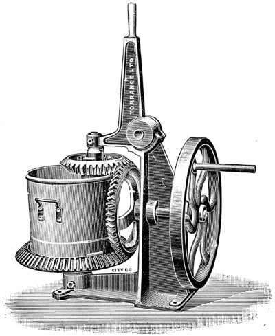
Fig. 1.
There are on the market two sorts of mixing machine for paints that would prove of great service to the painter who has to produce large quantities of paint. But, as a rule, they are only used by paint manufacturers. One known as the vertical mixer, is represented in Fig. 1, and is suitable for painters’ use. It consists of a cylinder which contains the paint, and in this are three bent knives or scissors. The handle attached, on being operated, turns the cylinder in one direction and the knives in the opposite direction, these knives in the meantime revolving around on their own axes. The paint is[10] thus mixed very quickly, and as the cylinder may be had to hold several gallons, in the case of bridge work, wall work, or other positions where a very large quantity of the same paint is required, the purchase, for a few pounds, of such a machine may mean a saving of a considerable amount of labour. The mixer illustrated is manufactured by Messrs. Torrance & Sons, of Bittern, Glos. In many shops, where large quantities of stone colour and other paints have to be turned out, such a machine would soon repay its cost.
For ordinary quantities of paint, of which white lead forms the base, the following is the method usually employed. It will be understood that the paint consists of a base such as white lead, linseed oil, either raw or boiled, driers—either patent or liquid—and turpentine. A can or kettle is most usually employed for mixing the white lead in, and this is first thinned out and mixed with the driers and oil, the colour being afterwards added to it. A little oil is first placed in the can, which is twisted around so that the oil covers every part of the inside surface. This prevents the lead sticking against the tin. A sufficient quantity of oil and the patent or other driers is then added. The most convenient implement for actually mixing the paint is a broad piece of wood shaped like a narrow spade, or a spatula may be employed. The lead is stirred and beaten against the sides of the tin until the whole is of the same consistency, and more oil is added until the thickness is not sufficient to support the stick standing upright. Turpentine may now be added to further thin the mixture, and then the colour is added. It may be noted here that the result is not so satisfactory if the turpentine is added before the oil. The best way of mixing actual colours is to place them on a stone, thoroughly amalgamating one with the other by means of a spatula. When the colour is what is required it is added to the white. To take a simple case of a gray, a little black would be beaten up on the stone, and when quite thin added to the pot of white. This would then be stirred up thoroughly and the grey colour observed to see whether it was sufficiently dark. Then a very little red and blue might be prepared on the stone and this be added to the pot, the mixture being again stirred. Two very important rules must be observed at this point. The first is that the colours ground in oil should be used and not dry colours. If[11] dry colours are employed oil must be added to them on the stone and not in the pot. We may repeat, by way of emphasis, under no circumstances must dry colours be added to the pot of colour. This is a rule to which there is absolutely no exception. The second rule, and one which is equally important, is to add only a small quantity of colour to the pot of white at the time. Taking the case once more of the grey, a little black being added and the mixture well stirred it can be seen at a glance whether the desired depth of shade is obtained. On the other hand, it would be quite impossible to take any of the black from the mixture, and should it be too dark the only way to lighten it would be to add more white, and this would probably mean mixing much more paint than was required for the job.
The paint having been mixed to the exact colour required, all that now remains is to strain it. A piece of muslin is often used for this purpose, but a far better method is to use a wire gauze strainer, which may be purchased for a small sum and will last for a considerable length of time. The advantage of this in addition to its permanence is that the hard portions of the paint may be beaten against the gauze, and so the waste be reduced to a minimum.
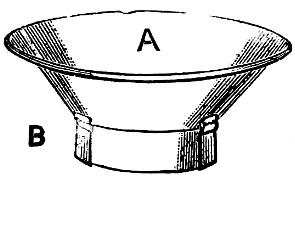
Fig. 2.
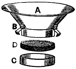
Fig. 3.
An excellent shape of paint strainer is that shown in Fig. 2, which is shown in parts in Fig. 3. A, represents the body of the strainer, B, the clips which hold the compression band C, and D, represents the gauze. The advantage of this construction is that the gauze after use may be easily taken out, cleaned and replaced. This strainer or its equivalent should form part of the equipment of every paint shop, large or small.
A very handy little tool for breaking up oil paint when mixing in a can instead of using a stick is shown in Fig. 4 (see next page). Its shape enables it to be used also as a scoop or spoon for lifting the colour out of the kegs, etc. The patentee and manufacturer is H. Smith, Hale Road Bridge, Altrincham, Cheshire. The illustration shows both sides of the tool. The projection on[12] the left hand of the carved blade is provided in order to reach beneath the rim of lever-top cans.
—We come to a consideration of the proper proportions of materials, viz., white lead (or other white), oil, turpentine and driers—the colour we shall speak about shortly—to be used on various kinds of work.
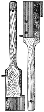
Fig. 4.
A little consideration will make it quite clear that it is impossible to give exact proportions of materials that will suit every job. These proportions are determined by the condition of the work. A new door of good sound pine will be treated differently to one made of an inferior wood, which is knotty and somewhat sappy. Again, a door that has been exposed to the weather for some years, and from which the paint has, perhaps, almost wholly departed, will require a different mixture to a front door from which the accumulation of old paint, extending, perhaps, to over one hundred years, has been burnt off. Precisely in the same way as patent medicines cannot be safely used for any and every complaint, so it is impossible to have paints that will suit any and every purpose. In one case the doctor is consulted and he takes into consideration every symptom and every condition and acts upon his diagnosis or scrutiny of symptoms. In like manner the decorator takes note of every condition of his work, and prepares his paint accordingly. Again, iron would not be painted with the same mixture as wood. Still if we cannot give exact proportions, we can, at least, give some information on the subject, which will form a guide and give some data for the reader to work upon. These we will give under separate heads.
—The usual plan is to use red lead mixed with linseed oil, the proportion required being about 14lbs. of linseed oil to every cwt. of lead. The second coat should be equal proportions of red and white lead mixed to a proper consistency with linseed oil. Sometimes oxide of iron paint is used instead of red lead.
—The priming must contain a considerable quantity of oil, because of the absorbent nature of the stucco,[13] and it should have a big proportion also of turpentine. Four galls. of boiled oil to a cwt. of red lead and three quarts of turpentine will usually answer. The second coat should be an equal mixture of red and white lead with a smaller proportion of turpentine and oil.
—With white lead use three-quarter ounces of driers and the same quantity of red lead to every pound of lead. Thin with about the same proportion of turps and raw linseed oil.
—Use about half-an-ounce of driers and one ounce of red lead to every pound of white lead.
—Use about one ounce of patent driers to every pound of white lead, with the addition of about the same quantity of red lead.
—To every pound of white lead add quarter of an ounce of copal varnish and the same quantity of gold size with half the quantity of boiled oil. These will serve the purpose of binding the materials together and causing them to dry. The thinners should consist of turpentine used in the proportion of about three-quarters of a pint to every 7 lbs. of white lead.

[14]
—We have thus far omitted to take into consideration the colours—or stainers, as most painters call them—that have to be used in the mixtures given in the last chapter, excepting, of course, when a white paint is required.
As a rule, one or several colours are added to the base producing a tint, shade, or hue, as may be required. Sometimes, but not often, colours are employed as “body colours,” that is, they are employed just as they are purchased, ground in oil, excepting that they are thinned down with the requisite quantity of oil and turpentine.
We may now give consideration to actual colour mixture, but must first make one or two points clear, so that the lists which follow may be properly understood.
First, then, it should be said that colours vary in appearance according to the light in which they are viewed. For example, a colour, when looked at in the light of a sunny day in the open, has a very different appearance to that when viewed in a dark room. This will be explained at greater length further on. The mixtures here given refer only to oil colours, and it must be clearly understood that the same results will not be obtained with artists’ water colours. In the case of the latter, tints are obtained by the addition of water just as they are produced in oil colours by the addition of white lead or other white pigment.
In examining the lists which follow the reader may ask why we do not give the actual proportions of the different parts. The answer is that this is impossible for two reasons, the first being that colours vary so largely in quality that the proportions would be useless unless some particular make of colours was taken as a standard, while the second is that the names of the same colour vary also largely. Let us consider this point at once.
[15]
—If half a dozen practical painters, experienced in colour mixing, were asked separately to mix a given colour, say a sea green, it is almost certain that when the six colours were compared there would not be two alike. Each of the six painters might have had precisely the same make of colours to work with and yet the “sea green” would in each case be different. The explanation, of course, is that opinions differ as to what is a “sea green.”
In giving the samples of colour which are contained in this work the author was, under the circumstances, somewhat puzzled to know exactly the right names to give each. His idea as to what was a bronze green, for example, might differ materially from the opinion of others, indeed, as it has already been explained, no two practical men would probably be found to agree as to the exact colour of two or three dozen differently named colours. Under these circumstances, he hit upon the plan of following what appeared to be the general rule in the trade. With this object he obtained the colour cards issued by all the leading paint manufacturing firms in the country, as well as some from abroad. He then took out the colours which he thought would be most useful to his readers, and then very carefully, and with a considerable amount of labour, compared each colour with similar colours in the different colour cards, taking note of the different names which different manufacturers called them. The result was very surprising, because it was found that in many cases there were as many names as there were manufacturers’ cards represented. When, however, the same name was used by several manufacturers, that name was selected for the purpose of this work. The reader may, therefore, take it that the names employed here are those which are most general in the trade. As an instance of the variation in these names we may cite a few examples.
Bronze green was called by different manufacturers’ dark green, olive green, and sage green. In this case bronze green occurred more frequently than any other name.
Tea green was called also olive green and Queen Anne green.
Apple green was called very light sea green and Eau de Nil green.
Sage green was called also olive and pale Quaker green.
[16]
Venetian green was called also Imperial French green, light green, shamrock green, bright green, mountain green, middle green, and engine green.
Light chocolate was called dark maroon, red lake, metallic brown, and in one case the sample given of burnt sienna was almost identical.
Olive green was called also sage green, deep olive green, and Quaker green.
Dark green was called also medium green, Brunswick green, middle green, and deep coach green.
Moss green some manufacturers evidently thought was the same thing as bronze green.
Pea green was called also sea green and eau de Nil.
Ivy green was called bronze green, sage green, Quaker green, olive green.
Slate was called also Quaker blue and dark lead.
Pearl gray was called also light gray.
Lilac was called also French gray.
Warm gray was called also deep stone, French gray, and light stone.
Silver gray was called also lavender.
Steel gray was called French gray in several instances, but we prefer to use the other term, as it appears to be nearer to what is usually known in this country as a French gray, that is one which has a touch of red and blue in it.
Another instance of the variation in the names of these colours is shown by light stone, which one would think was sufficiently well known to remove any doubt about it, but this was called smoke gray, French gray, and dove.
Middle stone was called also light drab.
Dark oak was called also dark drab and yellow bronze green.
Light drab was called also middle drab and doe colour.
Sandstone was called also dark stone.
Dove colour was called also deep stone.
Stone colour was called also ecru and light stone.
Colonial yellow was called also straw, light stone, and deep Naples yellow.
Buff in one case was called yellow ochre.
 MEDIUM OAK |
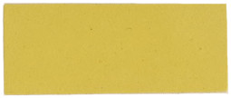 DEEP CREAM |
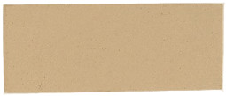
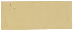 LIGHT OAK AND BIRCH |
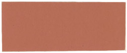 ROSE |
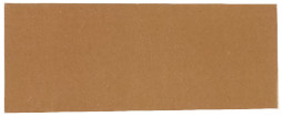 DARK OAK |
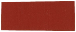 SIGNAL RED |
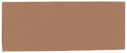 POLLARD OAK |
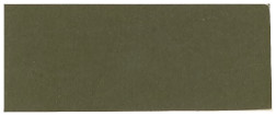 DARK SAGE |
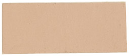 PITCH PINE |
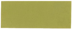 SAP GREEN |
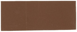 ROSEWOOD AND MAHOGANY |
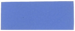 LIGHT BLUE |
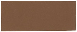 LIGHT MAHOGANY |
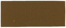 AMBER BROWN |
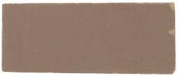 WALNUT |
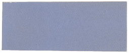 SKY BLUE |
GRAINING GROUNDS
[17]
Cream was called Manilla, light stone and deep deck.
Primrose yellow was called also mustard yellow, canary and straw colour.
Straw was called also Naples yellow and deep Naples yellow.
Deep cream was called also cream and lemon.
Fawn brown was called light drab and light lava.
Smoke colour was called rustic drab and drab.
Deep drab was called also dark stone, light drab, dark drab and fawn; one sample of raw Turkey umber was almost identical.
Dark drab was given also as dark lava and middle drab.
Dark oak was called also copper brown, light oak, and Imperial brown, whilst in one case a sample of dark ochre was almost identical.
Snuff brown was called also light brown, sepia, dark ochre, umber brown and Arabian brown.
Sienna brown was called also teak brown, coffee brown, deep Indian red and terra cotta.
Amber brown was called also bison brown, sepia, and dark oak.
Autumn leaf was called also leather lake, mast colour, middle oak, old gold, and light fawn.
Signal red was called also vermilion, geranium red and poppy red.
Moss gray was called also silver gray.
Acorn brown was called also umber, dark oak, dark brown, light brown, dark Indian brown, chestnut brown, middle chocolate and Portland brown.
With the above instances before him the reader will not, we think, take any exception to the names we have chosen for our sample colour. The same is true concerning the instructions for colour admixture. If a reader makes a mixture according to those instructions and finds the result disappointing, the reason will probably be that his conception of the particular colour differs from that of the author. And it should be mentioned again, here, that every one of the mixtures have been made in oil colours, checked and checked again.
For many years past efforts have been made by scientists and others to formulate a permanent nomenclature for colours, tints, shades, and hues, but it cannot be said that so far any success has[18] been met with. Should the efforts made prove ultimately successful, there is no doubt it would be a great boon to decorators, painters, and others; for example, if a decorator wanted to order from his manufacturer a certain tint of colour, all he would have to do would be to send in the name. Prang, of Boston, in his work, “The Standard of Colour,” endeavoured to systematise the subject, and he did this in the following manner. He produced sheets of colour divided up into several thousand squares. On the first sheet at the top was the spectrum of pure colours divided up, and beneath this similar squares with similar colours, to which had been added a small portion of white. The line below this was the same again with more white added, and so on till the bottom of the sheet was reached, when the colours were greatly reduced by the while, the tints being naturally very light ones. The second sheet was exactly the same as the first, but a small portion of black had been added to all of the colours and tints. The third sheet was the same thing again, with more black added, and the fourth sheet more black still, and so on to the end of the work. The colours were distinguished with letters, and the lines indicated the amount of white added by numbers. To anyone who possessed a copy of the work it would be a comparatively easy matter to order any colour from the book by number and letter, but the reader will readily perceive that this work falls short of the requirements of practical decorators, inasmuch as it does not provide for the admixture of different colours, but only those which are in the spectrum. It is true enough that all colours are as a matter of fact included in the spectrum, but it is not so easy a matter to separate them for practical purposes.
—It may be taken as a safe rule for the painter to follow that where a good job is required the best materials only should be employed, but the reader may answer to this that the price paid to him for his work will frequently not permit of his doing this. We may then leave the subject an open one which has really no place in these pages, except in so far as it relates to tinting colours, and here we can definitely and positively assert that it pays the painter best to use the best qualities of colour, quite irrespective of whether he gets a high price or a low price for his work. We must now proceed to explain this. Let the reader assume that a large surface is to be[19] painted a very light Prussian blue. The price for the work is fixed and the question to be determined is whether it will pay to use cheap Prussian blue or one of high quality. Assume that a high quality blue costs 2s. per pound, and that just one pound of it is sufficient to tint the whole white to the required shade. We are purposely giving a simple case so as to make the matter clear. Now a Prussian blue can be bought for, say, 1s. 3d. a pound, but it would probably consist of at least one half of barytes or some other adulterant, which is of no value whatever as a tinter. If this colour is half strength it is obvious that two pounds of it would be required to tint the white for the work in hand, and this would cost 2s. 6d., against 2s. for the better class colour. This homely example should be taken to heart by every painter. He has only to experiment to find out that it never pays to use inferior tinting colours. Of course there is another reason why the best quality should be used, and that is, the appearance of the inferior colours is always muddy and unsatisfactory.
—There is a good deal of confusion among some painters as to the meaning of the word “hue,” “tint,” and “shade,” although there is no reason why any confusion should exist. The word “hue” is employed to mean practically the same thing as a “colour.” It may consist of any mixture of other colours, or may be a pure colour itself. Now when white is added to any hue or colour a tint of that colour is produced. If black is added a shade of that colour is produced. In the decoration of our rooms we shall see that as an actual fact we obtain shades of the colour by the omission of light, because the addition of black as a pigment to a colour acts in the same way as shutting off light. In mixing colours it is important to remember that black should not be used to lower the tone of a colour excepting in rare instances. It only has the effect of producing a muddy appearance. A yellow that is too bright can be reduced, or made less staring, a painter might say, by adding a little blue and red. If a blue is too bright a little red and yellow should be added; or if a red is too bright it may be toned down by the addition of a very little blue and yellow. This is a most useful rule to observe, and as long as the quantity of the colours added is not too great the results will please.
[20]
It may be observed that in the colour mixtures which follow in no case has any white other than white lead and zinc white been used. In actual practice many manufacturers add barytes or some other cheap white to both colours and paints in order to lessen the cost. It is not thought necessary, however, to add these materials in the recipes, it being understood that their use can be proceeded with if necessary. We give a few mixtures for whites which will probably be found useful. There are no particular names applied to the following mixtures.
One part of barytes to six parts of white lead ground in oil makes a good white for outside use.
A permanent white which is not affected by gases, sulphuretted hydrogen, etc., is made by mixing two parts of oxide of zinc with one part of barytes. A warm white is made by mixing a small quantity of oxide of ochre, say one part to one hundred of white lead. Sometimes a little ivory black, say one part to three hundred, is added to the white.
White lead being sometimes a little “off” in colour, that is a little yellow in its cast, some blue is added to counteract this imperfection. Most of the corroders, however, exclude all the lead which is of a yellow cast and sell it to glass manufacturers, for whose purpose it is just as good as pure white.
A very little ultramarine green added to white lead makes a white sometimes called Japan white.
Equal parts of white lead and oxide of zinc are frequently used as a white paint, although two parts of lead to one of zinc gives a better mixture.
Some painters are under the impression that inasmuch as lead and zinc are both derived from metals they will not mix together to form a good paint, there being something of the nature of a galvanic[21] action set up between the two metals. This, however, is an error, for although lead and zinc cannot properly be mixed together by hand yet if they are ground by the ordinary paint manufacturers’ machinery the result is a most durable paint which will last many years; indeed, the writer has found this paint, with proper thinners, one of the best possible mixtures which can be used to resist the destructive action set up by alternate wet and dry days.
White lead is, of course, the staple white and the most important of all painters’ materials. Various new processes in white lead are in more or less successful operation. The old Dutch process, however, must be said to give the greatest satisfaction, generally speaking.
—Seventeen parts of white lead, three parts of barytes. This is intended to be mixed in oil, not water.
—The best quality barytes or blanc fixe makes a permanent white when ground in water. In oil it lacks body. For many purposes a white which will last a considerable length of time is made by mixing two parts of zinc white with one part of barytes.
—Space will not permit of the advantages and disadvantages of the various whites being treated here at length, but the reader can obtain reliable information on the subject from the books of Hurst, Pearce and others, as given elsewhere in this book. Briefly, white lead is valuable because it possesses better “body”—i.e., the property of covering or hiding the surface to which it is applied—than any other pigment. Its poisonous character is against it, as is also the fact that it is affected by certain gases. Zinc is an excellent pigment; it is whiter than white lead, but is somewhat deficient in body. Lithopone and Charlton white are both excellent substitutes for lead, and are non-poisonous.
[22]
Although the dictionaries usually do not distinguish between the spelling of “grey” and “gray,” and although many decorators use the two words indiscriminately, there is a distinct difference which it is both convenient and advisable to recognise. A “grey” is an admixture of black and white, and may vary from the smallest quantity of black added to white to the other extreme, where there is almost as much black as white. Anything between the two would be termed a “grey.” Examples of this are found in the list which follows under the heads mentioned below: Dark lead, dark slate, lead, etc. When a colour is added to the black and white the admixture is called a “gray,” provided, of course, that the black and white predominate, for example, a French gray is made by tinting white with a little ivory or drop black and adding a little carmine or crimson lake or ultramarine. What may be produced in other ways is noted below. It will be seen that the addition of the lake in ultramarine gives it a peculiar warmth which distinguishes French gray, and changes the spelling from “grey” to “gray.” Gray drabs are those in which a grey is coloured up to produce a yellowish tinge. Black being usually a strong tinting colour, care must be taken that it is used in moderation, and here the importance of adding a small quantity at the time, as already observed, will impress itself on the operator. After the shade desired has been obtained the colour should be added until the desired warmth is arrived at.
—A reddish gray tint, which can be produced by mixing together nine parts of black, sixteen of white, one of red and just a little orange.
—Lamp black and a little French ochre added to white lead give this colour. Another mixture is as follows: two[23] parts of burnt sienna, three parts of light ultramarine blue, sixty parts of zinc white.
—Mix together black and Prussian blue in the proportion of about thirteen parts of the former to one of the latter and add a little white.
—There is no exact point where this colour is produced by an admixture of black and white and a little orange or red. Mix eight parts of black, one of white and a touch of red to produce this shade.
—This is a dark grey, being produced simply by adding lamp black to white lead.
—This is simply mineral or other black added to white. The admixture under “Black Slate” would answer.
—Black, a little bright blue, and Indian red mixed with white lead produces this colour.
—This can be made by tinting white with a little ivory or drop black and adding a little carmine or crimson lake and ultramarine. This produces a very slight violet tinge. White tinted with a little ultramarine and Venetian red also gives a good French gray. Celestial blue or cobalt may be used instead of the ultramarine if desired.
—French ochre and lamp black added to white lead produce this colour.
—Mix five parts of black with three of white and three of blue and add a little red.
—Mix five parts of black with four of white and a little deep chrome yellow.
—Same as lead, but with more black and blue.
—Mix eight parts of black with two of white and a little orange.
—This may be described as “a pepper and salt shade.” Mix nine parts of black with two of white, with a touch of deep chrome.
—This is simply a dark gray, and is made by adding lamp black to white lead with sufficient blue.
—Mix together one part of ultramarine blue, one part of lamp black, ten parts of white lead. By adding more or less white lead a darker or a lighter shade may be obtained if[24] required. Another shade is obtained by mixing seven parts of black, four and one-eighth parts of white, and eight parts of blue.
—This is a dark gray shade. To produce it mix twelve parts of black with one of white, rather less than one of yellow and just a touch of orange.
—Tint white lead with French ochre, a bright green and a little lamp black.
—Eleven parts burnt umber, to which has been added one part of Prussian blue, mixed with about twenty times the bulk of white lead, will give this tint. Another shade may be had by mixing sixteen parts of white, three of black and one of blue. Some painters tint white with lamp black and add a very little Venetian red and burnt umber.
—An artist’s colour is sold under this name.
—Three parts of lamp black, one part chrome green, with about forty times the quantity of white lead, will give this colour.
—One part of burnt sienna, two parts of cobalt blue, and thirty parts of zinc white.
—Is an artist’s colour, which may be described as a gray having a lilac tinge.
—This is the same as French grey, but is much lighter.
—Forty parts white lead, five parts of vermilion and one part of deep chrome green. Some decorators tint white lead with lamp black and call that pearl gray. Strictly speaking, however, it should be called pearl grey, there being no colour present. Six parts of white lead, two parts of Venetian red, and one part of lamp black gives a somewhat dark pearl gray, but a lighter tint may easily be obtained by adding more lead. Ivory black answers equally as well as lamp black.
—This greenish gray shade is produced by mixing two parts each of yellow and green and five parts of white.
—Tint white lead with French ochre and lamp black.
—Tint white lead with French ochre and lamp black, or yellow may be employed instead of the ochre if preferred.[25] White lead tinted with a little lamp black and indigo gives an excellent silver gray.
—See “Dark Slate.”
—Tint white lead with French ochre and lamp black.
—Tint white lead with a mixture of lemon chrome and medium chrome and lamp black.
—Add black and chrome to white lead.
—Two parts of oxide zinc and one part of terra verte.
—Tint white lead with French ochre and lamp black or sienna and lamp black.

[26]
The reds vary from something just removed from brown up to the bright crimson and madders. A red that is too bright may be lowered by an admixture of blue and yellow. Exceedingly bright and pleasing tints of red may be obtained by using vermilionettes, but as a rule these are not permanent. For inside use, however, they may be employed, especially when they are protected by a coat of varnish.
—This may be described as a dark maroon. It is made by mixing five parts of black, three of Indian red and one of Prussian blue. Less of the black will give a more pleasing shade.
—This is a crimson which can be made by mixing three parts of vermilionette with one of Prussian blue.
—This is a reddish purple, and may be made by mixing two parts of black, one of white, six of a bright red, and six of Prussian blue.
—Mix middle chrome yellow with a little vermilion and add a very little lake.
—Mix one part of yellow ochre with two parts of Venetian red.
—A dull pink shade, which can be produced as follows: Mix together one part of Indian red, two of orange chrome, a little lemon chrome, and two of blue, lightening up with white.
—Mix together five parts of black, three of Venetian red, and a little orange chrome.
—A dark red purple, which may be obtained by mixing sixteen parts of lamp black, five of bright red, and four of blue.
—Take eight parts of black and mix them with one of a bright red and a little blue.
[27]
—Any bright red toned down with a little black will produce a shade sometimes called by this name.
—Take nine parts of black and with it two parts of orange chrome and one of Prussian blue.
—Use two parts of French ochre to one part of Venetian red and one part of white lead, adding more ochre if required to lighten the colour. This gives a good tint, sometimes called “brick red,” and is suitable for outside work.
—Mix twenty parts of vermilion, seven parts of pale chrome, and one part of golden ochre. A vermilionette slightly toned down with yellow answers the same purpose.
—This is a red toned down with about a fourth part of black, a little bright yellow or orange being added.
—Vermilion, to which is added about one twentieth part of Prussian blue, gives a colour sometimes called “Cambridge red.”
—This is an artist’s colour. Its rich red tint can hardly be imitated. A light vermilionette of good grade, to which is added a little bright yellow, may be used.
—This is a speciality of Messrs. Mander Bros. It is a rich and beautiful colour of vermilionette character, and when used for finishing coats should be protected with varnish. It is not suitable for distemper.
—This is a colour manufactured under this name which is registered by Messrs. Mander Bros. It is a bright strong red, which is useful when protected with two coats of varnish. It is of no use, however, for tinting purposes.
—Three parts of carmine lake and one part of white lead give a carnation colour, but a better result is obtained by taking pure vermilion as a base and adding carmine and zinc white until the desired rich colour is obtained. This colour is not suitable for use outside.
—Mix together crimson lake, burnt sienna and azure blue, or two parts of vermilion and one part of carmine.
—Mix two parts of carmine with one of ultramarine blue. A little vermilion may be added if desired, and this may render a little yellow necessary to tone down the colour. A less rich colour may be made by mixing Venetian red and yellow ochre.
[28]
—This colour is useful only on inside work. It is made by mixing five parts of vermilion, two parts of white lead and one part of chrome yellow. Another recipe for producing shades of coral pink is: one part of white, three of red, five of orange, and three of blue.
—This shade is produced by mixing Venetian red with a little lamp black and white lead.
—A dull yellowish crimson made by using five parts of black, one and half of white, two of orange, and one of blue, and a very little red.
—A dull orange red produced by mixing two parts of black, three of red, one of orange, and a little yellow.
—One hundred and twenty parts white lead, two parts yellow ochre, and one part Venetian red will produce an excellent flesh-colour. Or mix eight parts of white lead, two parts of orange chrome yellow, and one part of light Venetian red. An increased proportion of red may be employed where desired. A mixture of orange and white in the proportion of one part of the former to three parts of the latter may also be used, or a mixture of medium chrome yellow, ochre, and Venetian red added to white.
—Use equal parts of Indian red and vermilion, and glaze with carmine.
—To obtain this mix Venetian red, lamp black and Indian red, and add sufficient white lead to produce the desired shade.
—To produce this colour use nine parts of bright red and one of blue. Or Indian red may be used, afterwards glazing with madder lake for good work. Most of the larger colour manufacturers make geranium red, which is better than one can obtain by mixing.
—Tint white lead with a little Indian red.
—This is a good permanent pigment to be bought ready made, and is most useful in mixing with other colours.
—Tint white lead with a little pure vermilion.
—Tint white lead with raw Italian sienna, burnt Italian sienna, and burnt Turkey umber. Or tint white with any bright red, toning down with sienna.
[29]
—A great deal of difference of opinion exists as to this tint. One part of ultramarine to one part of bright carmine, added to eighty parts white lead, give a very good lilac. A cheaper way is to use Indian red and lamp black as a tinting colour, or rose pink may be added to the lead only. Yet another method for producing a lilac is to mix three parts of bright Indian red, three parts of white lead, and one part of ultramarine blue, but less white lead is preferred by some painters. A touch of yellow will help this colour if too raw for the purpose.
—This is principally used by artists, but it is useful to the house decorator for glazing the best work where a bright red is required.
—Carmine and vermilion, with a little ultramarine blue, produce this colour.
—This colour is obtained by mixing carmine and blue black, and adding a small quantity of medium chrome yellow. It may also be made by mixing one part of ultramarine blue with three parts of Tuscan red. This gives a tint that is often considered a little too red, but this defect may easily be remedied by adding more blue. Some painters add ivory black and a little chrome yellow to carmine.
—Mix one part of red lead with four parts of Venetian red.
—Three parts of blue and seven of red, mixed with a little white, give this purplish red shade.
—Mix together three parts of vermilion and one part of rose pink.
—This is a very dark purple obtained by adding a little blue and just a tinge of red to black.
—Tint white lead with French ochre, Indian red, and lamp black, or Venetian red and lamp black may be used if desired.
—Tint white lead with red lead.
—Tint white lead with a mixture of five parts of vermilion and one part of medium chrome green.
—Mix one part of red lead with two parts of Indian red.
[30]
—This colour may be obtained by adding two parts of orange lead to one part of white lead.
—Orange lead comes nearest to this colour. The tone may be made by adding chrome to vermilion.
—This is a mixture of white lead and Venetian red. Or it may be produced by adding sufficient Indian red to white lead to give a warm tint and mixing it with equal proportions of white lead, lemon chrome yellow, ultramarine blue and light Indian red. Or a mixture of three parts of Indian red with seventeen parts of white is sometimes used.
—White lead tinted with orange lead gives a bright pink.
—Mix with equal parts of white lead, Indian red and ultramarine blue in the proportion of two parts of lead to one of each of other colours. This makes a dark plum that is only suitable for inside work. If a light tint is desired add more white lead. A very rich plum may be obtained by mixing together ultramarine blue and carmine, and adding a little white and a little yellow.
—Small quantities of red and orange are mixed with black to produce this shade.
Blue and vermilion mixed in the proportion of one of the former to twenty-four of the latter give this shade.
—Light Indian red, four parts; white lead, three parts; ultramarine blue, two parts; or a purple may be obtained by mixing Indian red and white. A mixture preferred by some painters is made by mixing ultramarine and vermilion with a little white. A little crimson lake gives richness to the colour.
—This earth colour is cheap, and can be readily bought in most places. It can be imitated by mixing India red and chrome and adding a little vermilion.
—Use equal proportions of burnt sienna and white lead. The tone may be varied by the addition of either of the umbers and the chromes. A good bright terra-cotta is also made by using Venetian red as a base and colouring up with ochre and a touch of lake.
—Mix together four parts of white lead, two parts of cobalt blue and one part of carmine lake.
—Mix black with half its quantity of red and add a very small proportion of blue and white.
[31]
—Five parts of white lead mixed with two parts of carmine give a rose colour that is suitable for inside work only. An admirable rose colour may be obtained by using zinc white instead of white lead, as the zinc is a much purer white than the lead, and hence gives a purer tint.
—Mix together one part of rose madder and eight parts of oxide of zinc. This is a beautiful colour, but the madder is too expensive for use except by artists.
—To produce this colour, red is mixed with about twelve times the quantity of black and a very little green. The shade given is a very dark red.
—Mix together two parts of zinc white and carmine lake. This will only do for inside work.
—Mix one part of vegetable black, one and half of rich red, and seven of Prussian blue. Some manufacturers make this colour ready for use.
—Six parts of white lead, one part of vermilion, and a little lemon chrome yellow. This mixture produces a colour somewhat bright. Another salmon colour is made by a mixture of raw sienna, burnt sienna, and burnt umber. A tint preferred by some is produced by adding to the white, Venetian red, burnt umber and French ochre. Another method is to add vermilion and golden ochre to white, which gives a nice bright colour. Venetian red and chrome, added to white, gives a duller colour. Still another mixture is Venetian red, vermilion, yellow ochre and white.
—This colour can be purchased ready made. A colour very similar may be obtained in one of the many vermilionettes on the market. It will be convenient to remember that all vermilions are lightened by the use of pale chrome instead of white lead. Lead takes down the brilliancy of the colour, producing a pink.
—This is bought ready made. It is the name given to the brightest of the oxide paints.
—This colour is sometimes made by adding a little good Indian red to white, but some decorators prefer to use vermilion with a little chrome yellow and burnt sienna.
—Mix Venetian red, burnt sienna and white lead, and add a little vermilion.
[32]
—This is a speciality of Messrs. Mander Bros., a deeper shade being termed Carmoisin madder lake. Both are perfectly fast to light, even when used for tinting purposes, and are admirably adapted for the use of the decorator.
—This is usually made by mixing orange lead, vermilionette and Paris white, or orange lead by itself may be tinted with vermilionette. “Signal Red” is a well known speciality.
—Mix together two parts of white lead and one part of burnt sienna. See also under “Red Terra-Cotta.”
—Mix equal proportions of Indian red, vermilionette and rose pink.
—This can be bought ready made, and may be imitated by mixing ten parts of Indian red with one part English rose pink. Indian red is very similar in colour but somewhat darker.
—Tint white lead with a little Venetian red.
—This colour is one of the most useful that the house painter has, being cheap, and having good covering power and body. It is not very good for tinting purposes. It would not, of course, be often imitated, but Indian red—a very similar pigment—could be tinted with red. Or it may be imitated by mixing vermilion, yellow ochre, madder carmine, and a little Cappagh brown, which is an artist’s colour and is rarely used by house painters.
—This bright red cannot be imitated by an admixture of ordinary pigments, but there are many excellent substitutes on the market, most of them being vermilionettes.
—Add a little ivory black to a mixture of carmine and vermilion.
[33]
But few general remarks are necessary concerning the mixture of blues. Indigo is used far less, of course, than Prussian blue, which is the most useful blue employed by the house painter. When burnt sienna and white are added the brilliance is toned down.
—This colour should always be bought ready made. If necessary to imitate it, mix one part of bright green with two parts of ultramarine; add a very little zinc or other white, but not lead. Brunswick blue is frequently used in the place of Antwerp blue.
—One part of ultramarine blue and forty parts of zinc white. Another shade may be obtained by mixing forty-four parts of white, twenty-nine of green, and twenty-seven of blue. Or celestial blue and a little red on a base of white will give an azure shade.
—This is only another name for Prussian blue.
—One part Prussian blue, three parts of emerald green, seven parts of white lead.
—This is a colour to be bought only ready made. It is not now much used, and is not suitable for an oil colour.
—A dark blue colour, which may be made by mixing three parts of black with one of Prussian blue.
—This is bought ready made, and can be imitated by adding white lead to Prussian blue in sufficient quantity to obtain the desired tint.
—This is an artist’s colour of a light and somewhat greenish blue tone. An imitation may be made from ultramarine and white, with a little yellow, although the colour is a difficult one to imitate successfully.
[34]
—About equal parts of Prussian blue, chrome green and white lead will give this colour, but there should be most white, and the tint should be more blue than green.
—Another name for Prussian blue, which see.
—This colour is one of the best artists’ colours, and cannot be successfully imitated. It is a beautiful and most useful colour, but unfortunately it is expensive, and it is, therefore, only used in the finest work.
—Obviously this is no very definite colour. Manufacturers often use one part of white, two of chrome green, and seven of Prussian blue. But ultramarine, or indeed any blue, may be used, and this may be first lightened with white and black added as may be desired.
—Equal parts of burnt sienna and Prussian blue, lightened up with about twenty parts of white lead.
—Mix four parts of white, one of green, and four of ultramarine blue. The name is also applied to the best quality of artificial ultramarine.
—Mix together four parts of ivory black, two of white, one of chrome green, and three of Prussian blue.
—To produce this shade mix two parts of black with six of white and one of ultramarine blue.
—This colour is obtained by using two parts of zinc white, three of bright red, and four of ultramarine blue.
—This is made simply by mixing ultramarine with white. Barytes and zinc mixed are frequently used for the white, as lead cannot be employed in the presence of ultramarine.
—This dark blue is, of course, a natural vegetable pigment. An imitation may be produced by using nine parts of black and four of Prussian blue, but this will not look like the real thing. Indigo should not be mixed with lead or lead chromates.
—Three parts of ultramarine blue and one part of carmine, added to zinc as a base, give a very good lavender tint for inside work. Ivory black mixed with a little carmine and ultramarine and added to white lead may be employed for outside work.
—This is simply an ultramarine blue tint produced[35] by the addition of zinc. Or the colour may be obtained by tinting white lead with Prussian blue.
—This is a colour much used formerly for mixing distemper, but artificial ultramarine has to a great extent supplanted it. It must not be used in oil. What is now usually sold for lime blue is a variety of ultramarine.
—A very dark blue, which is obtained by mixing one part of ultramarine blue with nine of ivory black.
—This is a very dark blue shade, which is got by mixing black and blue in the proportion of seven parts of the former to one of the latter with a very little green.
—Four parts of cobalt blue, twelve parts of oxide of zinc, and one part of carmine lake give an excellent mauve, or the colour may be obtained by mixing yellow ochre, blue black, and Venetian red with a little white lead. Another shade is obtained with blue, red and white mixed in the following proportions: blue, three parts; white, two parts; red, one part. Or white may be tinted with ivory black, carmine and ultramarine.
—Mix green with twelve times its quantity of blue and a touch of red.
—One part of ivory black, two parts of rose madder, three parts of cobalt blue, and four parts of white lead. This colour is only intended for artists’ use.
—Ivory or drop black mixed with one-fourth the quantity of blue will give this shade.
—A series of neutral blues may be made by tinting white lead with Prussian blue and adding burnt umber, the quantity of blue and umber being varied according to the tint required.
—Mix a little white with Prussian blue and chrome green, using rather less of the latter than the former. The result is a pale greenish blue.
—To get this greenish blue shade mix green and blue in about equal proportions with white.
—One part of lemon chrome yellow, two parts of Prussian blue and twenty parts of white lead.
—This colour is one upon which opinion varies[36] considerably. A splendid colour is made by taking cobalt as a base and adding a little white and a little Chinese blue.
—Some manufacturers produce this beautifully rich colour. It is very like cobalt, but slightly darker.
—This is made by tinting white with ultramarine and adding a little vermilion and Italian ochre.
—To get this shade mix one part of zinc white and chrome green with four parts of ultramarine blue and a touch of black.
—This colour is certainly the most important blue the house painter has. It cannot be imitated. It works well in both water and oil, and is transparent.
—Add a little black to Prussian blue, and lighten up with white.
—Use white for base, tint with ultramarine until a fairly strong blue is obtained, and then tinge with a little lemon chrome green.
—This is made by adding a little white to Prussian blue with a touch of crimson lake. Some manufacturers make a very rich blue, which they sell under the name of Royal blue.
—One part of Chinese blue mixed with double the quantity of oxide of zinc. This should not be used for outside work.
—Two parts of Prussian blue, three parts of raw sienna, thirty parts white.
—One part of Prussian blue added to one hundred and twenty parts of white lead give a sky blue, but some prefer cobalt, and this is for many purposes doubtless the best. Still another method of obtaining sky blue is to tint white lead with a little lime blue, adding a very little middle chrome, but the latter is more suitable for a distemper colour than it is an oil paint, as lime blue is not very lasting in oil.
—Zinc white tinted with lime blue gives this colour for distemper.
—One part of raw umber, twice the quantity of Prussian blue, on a base of white lead will give this colour.
—Mix together four parts of ultramarine[37] blue and one part of crimson lake. This is suitable only for artists’ use.
—Two parts of cobalt blue, one part of emerald green, twelve parts of white lead.
—This is one of the chief blues used by the painters, and must be bought ready made. It cannot be imitated, but it can be bought in many different qualities. It must not be mixed with chromes or white lead, as it contains sulphur, and there would on that account be a likelihood of discolouration. Natural ultramarine is very expensive.
[38]
A great variety of yellows may be obtained by using the different shades of yellow chrome, etc., on the market, adding a little red occasionally. It may be taken as a general rule that blacks should not be added to yellow unless a greenish tint is desired. If a yellow is too bright it may be lowered by adding a small quantity of blue and red. Instructions for obtaining the various grades of yellow are given explicitly below.
—This is yellowish white in colour. Mix four parts of white with one of middle chrome yellow.
—An imitation of amber can be produced by mixing equal portions of burnt sienna, burnt umber, blue black and orange chrome yellow, and adding a quantity of white lead until the desired tint is obtained.
—Add ivory black to orange chrome yellow in the proportion of about five parts of black and one part of orange.
—One part medium chrome yellow, two parts raw umber, and lighten with white lead.
—This may be obtained by mixing forty parts of white lead, twelve parts of light chrome yellow, one part raw umber, and one part burnt umber. Or a mixture of French ochre and medium chrome yellow, added to a little umber, with a touch of blue, may be used to tint white as a base.
—Take fourteen parts of black and add one part of yellow and two of green.
—Mix together five parts of medium chrome yellow, three parts of white lead, and one part of raw umber. A mixture preferred by some painters is obtained from chrome yellow, French ochre and a little burnt umber.
[39]
—Two parts of white lead and one part of yellow ochre produces a good buff, or white lead may be tinted with French ochre alone. Other shades are obtained with mixtures of two parts of black, four of white, one of red, and one and one-eighth of yellow.
—White lead tinted with lemon chrome gives a nice buttercup yellow.
—This is an artist’s colour of considerable value, but is, generally speaking, too expensive for house painters. It should not be mixed with chrome yellow or emerald green. It is made in three shades: pale, medium and deep, and it cannot be successfully imitated.
—This is practically another name for straw tint, and it may be mixed in the same way. The proportions for an ordinary shade of canary are three parts of lemon chrome yellow to one part of white lead, but less yellow is often preferred. Another shade is obtained by mixing two parts of white, six of yellow and two of green. Some manufacturers make an extra light chrome yellow which they call by this name.
—A dull yellow made by mixing four parts of white, five of yellow ochre and one of green.
—Mix together five parts of white lead, three parts of raw sienna and one part of lemon yellow.
—Although this is a tertiary colour, and theoretically can be made from green and orange, opinions as to the exact shade somewhat differs. It may be made by mixing four parts of medium chrome yellow and one part of raw umber; or five parts of lemon chrome yellow and two parts of raw umber.
—To produce this colour use Venetian red as a base and add one part of Prussian blue, two of chrome yellow and two of white.
—Medium chrome yellow mixed with white lead and a little dark orange chrome yellow gives this tint.
—A good shade is obtained by mixing eight parts of white lead, two parts of French yellow ochre and a touch of Venetian red. French ochre and lead alone are often employed. There are many other methods of obtaining this tint. Note.—Light buff, medium buff, and dark buff may all be obtained in the same way by adding more or less of the French ochre or white.
[40]
—Lemon chrome mixed with a little Venetian red will give this colour.
—This colour is made by tinting white lead with yellow ochre and a little Venetian red. (See Cream.)
—Tint white lead with French ochre and medium chrome yellow. A tint which is sometimes called stone colour is produced in the same way. Another shade of ecru may be obtained by mixing three parts of black, eight parts of white, three of medium chrome yellow, and one of Brunswick green.
—This is an artist’s colour. It is a gum resin, is somewhat fugitive, and is useless for the purpose of the house painter.
—To obtain the colour known as “gold” white lead may be tinted with five parts of golden or yellow ochre, and one part of vermilion, or a mixture of light chrome yellow, French ochre and vermilion may be used instead to tint the white lead. The quantity of yellow used should be considerably more than the ochre.
—French ochre, medium chrome yellow, and lamp black used as tinting colour for white lead will give a hay colour, or raw Italian sienna and lamp black may be employed if desired.
—The addition of a very little medium chrome yellow to white lead produces this tint, or a very little golden ochre may be used.
—Tint white lead with medium chrome yellow to which has been added a very little vermilion red. One of the favourite methods is to employ sixteen parts white lead, one part of indigo and two parts of light red, adding as much chrome yellow as may be desired. Another way of making jonquil yellow is by simply mixing with a little green about forty times the quantity of yellow.
—This is a pale yellow shade, which is obtained by mixing white and medium chrome yellow in about equal proportions.
—For this colour lemon chrome yellow is used alone, but the tint may be made by using white lead for a base and adding medium chrome yellow until the desired tint is obtained. The tint that is usually preferred is obtained by mixing five parts of chrome[41] to two parts of white lead, and adding a little green. However, lemon chrome yellow purchased ready made is the best.
—A little yellow ochre added to white lead gives a good buff colour, the tint varying with the quantity of ochre.
—This colour may be produced by mixing medium and lemon chrome yellow with white.
—Tint white lead with French ochre and lamp black.
—This is also called lemon chrome, and is the palest shade of lemon chrome yellow. It is very useful for preparing the lighter shades of yellow, and may be imitated by adding cadmium yellow to zinc white.
—Mix yellow and white in the proportion of about three parts of the former to one of the latter to get this light yellow shade.
—This is intended to be used as a substitute for old Oxford ochre, but is claimed to be superior. It is based on ochre and is of great strength and body.
—This colour is sometimes called “deep deck.” It is made by tinting white lead with French ochre and chrome yellow. Or a mixture of white with four times the quantity of yellow will produce a shade of manila.
—This is obtained by mixing a very little bright yellow with orange chrome.
—Mix equal quantities of black and white; add twice the bulk of orange chrome and a quantity of medium chrome equal to the mixture of black and white.
—A dull yellow shade, which may be obtained by adding one part of orange and two of yellow to ten parts of black.
—Mix as described under “Stone,” but use more umber and ochre.
—This yellow is not now much used, chrome yellow having to a large extent taken its place. It may be imitated by tinting zinc white with cadmium yellow and a very little yellow ochre.
—This is obtained by mixing orange with twice as much yellow and three times as much white. It is also the name given to an artist’s colour.
[42]
—Mix orange and yellow in about equal proportions with a rather larger quantity of black.
—Use middle chrome with a little vermilion and burnt sienna, and add a very little cobalt. A cheaper colour may be made by mixing ochre and burnt sienna. One part of green and three of bright yellow mixed with a little white will give an old gold shade. Or it may be obtained in the same way as Gold, which see, but a little burnt umber may be added. Some painters prefer to tint white lead with a mixture of chrome, raw sienna and vermilion.
—This colour is sometimes called olive brown. It is made by mixing three parts of burnt umber with one part of lemon chrome yellow, a larger quantity of yellow being added if a lighter shade is required. Another method is to mix ten parts of black, one of orange, twelve of yellow, and five of green.
—Mix white, yellow and orange in the following proportions: one part each of yellow and white and eighteen parts of orange. Or another shade is got with seventeen parts of orange, six of yellow and two of white. Orange chrome yellow can be easily purchased, however, and gives this colour without any admixture being necessary.
—Mix fourteen parts of orange chrome, five parts of yellow ochre and one of white.
—Tint white with Italian ochre and add a very little ultramarine and vermilion.
—Mix equal parts of yellow ochre and raw umber and lighten up with white until the desired tint is obtained.
—Lemon chrome used by itself answers admirably.
—Ten parts of white, three parts of green and four parts of yellow will give this light greenish yellow. Another shade is got by mixing one part of orange, two parts of green and five parts of yellow.
—Add a little Venetian red to a mixture of French ochre and white lead.
—This colour, so much used in London, is usually made by mixing together five parts of white lead, two parts of French[43] yellow ochre and one part of burnt umber. By adding a little raw umber, the tint may be varied as desired. This colour is suitable for outside work. Another method for obtaining the shade is to tint white with medium chrome yellow and burnt umber.
—Lemon chrome mixed with raw umber.
—White lead tinted with a little chrome yellow produces an excellent straw tint, but some prefer to add a little French ochre. Or medium chrome yellow may be used as a base, and a mixture added of white, French ochre and Venetian red.
—This is a somewhat fugitive colour which has but little body, but is useful for glazing. To imitate it use equal parts of burnt umber and white lead and tint with chrome yellow and lake. Or, mix umber and white in equal proportions and add Naples yellow and scarlet lake. To obtain this colour in its full richness it is quite necessary to glaze either admixture with yellow lake.
—The ochres are natural mineral pigments, which are among the cheapest and most useful at the command of house painters. They can be used in any vehicle and are quite permanent, while they do not affect any other colour with which they may be used. Oxford ochre is generally accepted to be the brightest of the series, while it is distinguished also for the depth of its covering power.
—This is a chromate of zinc which is quite fast in light, and possesses the advantage of permanence even in the presence of impure sulphuretted hydrogen, etc. It may be mixed with other colours without adversely affecting them.

[44]
There is, of course, an immense range of greens, and the list below includes only those which are more or less frequently called for. To obtain a green, one can mix with yellow either blue or black. This forms a very good example of the difference which is obtained by mixing rays of light and pigments. The painter who wishes to make a systematic study of the subject of colour mixing is advised to experiment. He may first mix, say, medium chrome yellow with Prussian blue, then with cobalt and then with ultramarine or indigo, noting carefully the difference in the hue obtained. It is well to keep the quantity of chrome about the same in each case, so that the difference obtained by the use of the respective blues may be the better appreciated. He should then change his yellow, mixing the same proportions as nearly as possible with lemon chrome and then with deep chrome, again noticing the difference in the colours obtained. Having done this he can go back to middle chrome and mix black with it in varying proportions. In this way he will obtain a good deal of practical knowledge in a short time concerning the different shades of green obtainable from these simple mixtures, and he will at the same time not forget the relative costs of the different materials, so that he may learn to obtain desirable mixtures of colour from the least expensive of the pigments. Sometimes a green is obtained simply by lightening up, with white, a stock commercial green, for example, pea green may easily be obtained by lightening pale Brunswick green. In some cases greens are produced by an admixture of two or more colours, such, for instance, as Willow Green, which is made from ochre and indigo, and Olive Green from ochre and French ultramarine. Others have the addition of white, such as Grass Green, which is white ochre[45] and cobalt, and Spring Green, which is white, middle chrome and black.
Having performed the foregoing experiments, the reader should next take up the study of lights and shades. In other words, he should add to the various mixtures obtained in the manner described, different quantities of first white and then black, and notice the effect obtained.
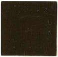
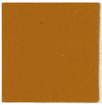
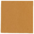
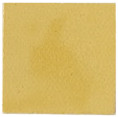
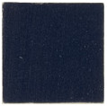
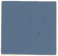
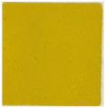
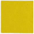
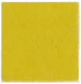
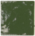
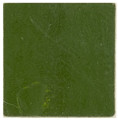
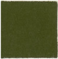
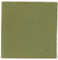
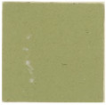
Some colours are very much stronger for tinting purposes than others. For example, a Prussian blue will go a long way and a very little is sufficient to colour a considerable quantity of white lead. In the plates we show pure Turkey umber, French ochre, raw Italian sienna, orange chrome yellow, Prussian blue, medium chrome yellow, etc. Each of these is also shown when mixed with twenty-five parts of zinc and one hundred parts of zinc respectively. The object of using the zinc instead of white lead is to obtain a purer tint, the white being much whiter than white lead. A careful examination of this tint will give some useful information concerning the tinting strength of different colours. Observe, for example, Prussian blue, which is quite a decided blue even when only one part in one hundred of the colour is used. The next thing to be done is to add a little black to these colours and to note the result. We must urge the reader not to use black in reducing his colours as a rule. If it is desired to reduce or lower a yellow in tone use blue and red, if a blue is too vivid add a little red and yellow, and if a red is too bright add a little blue and yellow—in other words, taking the three primaries, add to any one a very little of the other two.
—A pale sage green shade. To obtain it mix six parts of black, three of white, one of chrome yellow, and three of Brunswick green.
—The simplest way to obtain this is to mix medium chrome green with about thirty times the quantity of white lead, but other greens may be employed with the addition of a little Prussian blue when necessary. Or a little orange chrome yellow may be added to the medium chrome green and white lead. A very good shade can be produced by mixing one part of white with four of yellow and nine of green.
—Mix one part of chrome yellow with seven of black and two of emerald green.
[46]
—Equal proportions of deep chrome green and cobalt, or three parts of chrome green and one of Prussian blue, added to white lead in the proportion of about four times the quantity of lead to the mixture of green and blue, will give a tint which is sometimes called “blue green.”
—Mix together five parts of medium chrome green and one part of blue black. A similar colour may be obtained by adding Prussian blue to blue black and lemon chrome. Another shade is made by using four parts of black and one of green.
—The usual method is to mix black with chrome yellow (deep), but indigo may be used instead if desired. A much brighter colour is obtained from a mixture of medium chrome yellow, Prussian blue and burnt sienna. Or the following recipe may be used: Medium chrome green, five parts; blue black, one part; burnt umber, one part. A light bronze colour may be obtained by adding more green or by using light instead of medium green. Other shades of bronze green may be got by adding a little lamp black to dark chrome green, or by taking medium chrome green and adding lamp black and a little raw umber.
—This colour is sold in three shades. It may be imitated by a mixture of Prussian blue and chrome yellow, but chrome green, toned down with black, is sometimes used.
—This is a light yellowish green colour. Mix four of chrome yellow and five of chrome green, lightening up with white.
—This colour is bought ready made. To produce it by admixture, add Prussian blue to lemon chrome yellow in the proportion of about one part of blue to eight parts of yellow.
—Tint white lead with medium chrome yellow, emerald green and a touch of Prussian blue.
—Add two parts of raw umber and one part of lemon chrome yellow to white lead. Give the green tone to it by means of a little Prussian blue.
—A dark green, obtained by adding a little emerald green to black.
—This beautiful, bright green cannot be successfully imitated. It must not be mixed with ultramarine. The pigment is a great favourite with some painters, while others never[47] use it. In America, the pigment is known as “Paris green,” but it is not there used to any extent by painters, although it is used as an insecticide. In the absence of the real thing, a more or less presentable imitation may be obtained by mixing eight parts of white lead and one part of medium chrome green, or a light shade of chrome green may be used without lead.
—One part of blue black may be mixed with four parts of lemon chrome. Use medium chrome yellow if a darker shade is required.
—This is a bright yellowish green, which may be obtained by adding to emerald or deep chrome green about one-tenth part chrome yellow. Yellow ochre is sometimes used instead.
—This is a variety of sage green. It may be made in the same way as pea green, and when that is reached a little black should be added to bring it to the required sage colour.
—This is usually to be had ready mixed, but it varies considerably in name as well as in the exact tint. It comes very near to what some manufacturers call deep royal green, while it is not far removed from an olive.
—The colour sold as “extra light chrome green” makes a splendid grass green without any addition, but if it is not available lighten up medium or dark chrome green with chrome yellow.
—Tint white lead with a bright green toned down with ochre and lamp black.
—Twelve parts white lead tinted with one part medium chrome green and one part of raw umber give this tint, or the tinting colours may be French ochre and emerald green with a little lamp black.
—Use ultramarine blue, lemon chrome yellow, blue black and white lead.
—A dark green made by mixing nine parts of black and one of bright green.
—This is produced by a mixture of French ochre, lamp black and Prussian blue.
—This colour is suitable for inside work. It is made by mixing orange chrome yellow, light chrome green and white lead in equal proportions.
[48]
—Equal quantities of white and blue and rather more than twice the amount of green give a very good shade.
—This is bought ready for use, and is only suitable for distemper, etc. It cannot be used with oil.
—This is produced from a mixture of a bright green, medium chrome yellow and French ochre.
—Mix one part of middle chrome green with four of black.
—A green of this name may be purchased ready made. It is very similar to middle Brunswick green.
—This is a dark green shade, obtained by mixing one part of chrome yellow and one of Prussian blue with three parts of chrome green and fifteen parts of black.
—This is a dark sage-yellow greenish shade. It may be obtained by mixing six parts of Prussian blue, thirteen of chrome green, three of orange chrome, eight of white, and twenty of black.
—Tint white lead with French ochre, a bright green and a little lamp black.
—This pale greenish shade is obtained by mixing chrome or Brunswick green, bright yellow and white in the proportions of one part green, four of yellow and three of white.
—Add to medium chrome yellow sufficient cobalt to produce the desired hue, adding a little white if necessary.
—Three parts of dark chrome green, one part of ultramarine blue, and a little white lead will give an excellent myrtle colour.
—Seven parts of chrome green and three parts of yellow ochre will give this shade.
—Five parts of white, nine of emerald green and six of Prussian blue will give this shade.
—Mix together ten parts of lemon chrome yellow, one part of ultramarine blue and one part of light Indian red. Another method is to use eight parts of lemon chrome yellow, one part of blue black and one part of Prussian blue. Or the following proportions give very good shades: three parts black, four parts white, four parts red, two parts yellow, and eleven parts green; or, fifteen parts of white, twenty of red, twelve of yellow, and fifty-three of green. Some painters add equal portions of Prussian blue and lamp black to lemon chrome yellow for a base, or the base may be ochre instead of chrome, and a little of the yellow be added.
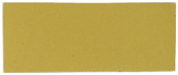 BUFF |
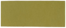 SEERED GREEN |
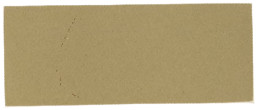 DOE COLOUR |
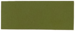 MOSS GREEN |
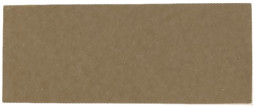 SANDSTONE |
 LIGHT CHOCOLATE |
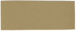 LIGHT DRAB |
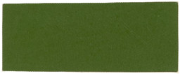 VENETIAN GREEN |
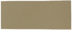 STONE GREY |
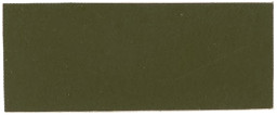 SAGE |
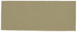 STEEL GREY |
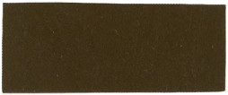 BRONZE BROWN |
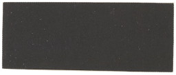 SLATE |
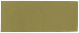 TEA GREEN |
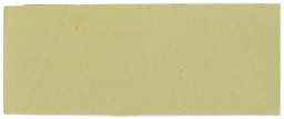 PEA GREEN |
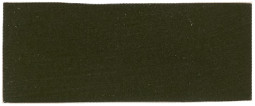 BRONZE GREEN |
[49]
—Is made by mixing equal proportions of raw umber and lemon chrome yellow.
—This colour is bought ready made.
—A mixture of seven parts of white, fifty parts of emerald green and forty-three of Prussian blue will give this shade. A little yellow is sometimes added.
—Forty-eight parts of white lead and one part of chrome green will give this colour, or emerald green may be used if desired. Some makers mix medium chrome green and white lead in the proportion of five parts of the latter to one part of the former to obtain a pea green, but the proportions may be varied considerably according to the exact shade required.
—This is only another name for emerald green, the vivid and somewhat staring hue being sometimes employed in Oriental decoration and being then termed “Persian Green.”
—This is a yellowish green shade. It may be got by mixing seven parts of black, one of yellow ochre and one and half of chrome green. Or chrome yellow may, if desired, be substituted for the ochre.
—To produce this mix five parts black, three parts chrome yellow and twelve parts emerald or medium chrome green.
—Mix equal proportions of Venetian red and medium chrome yellow and add blue black. Add to this mixture a quantity of chrome green equal in bulk to the three. This will give an excellent quaker green.
—Mix white, chrome yellow and chrome green in about equal quantities to produce this shade. The name, however, has no special significance, and an admixture of almost any yellow and green, lightened up with white, might be used instead.
—This may be produced by tinting white lead with four parts of light chrome green and one part of ivory black, or the white lead may be tinted with a mixture of French ochre, lamp black, and Prussian blue. Another recipe is as follows: Add[50] raw umber and chrome green in the proportion of about one part of the former to two parts of the latter added to white lead until the desired shade is obtained.
—Mix with white lead medium chrome yellow and a very little lamp black.
—Tint white lead with medium chrome yellow and emerald green, or if too bright use medium chrome green instead of the emerald.
—This colour is obtained by adding deep chrome to white lead. Another sea green, and a very good one, is obtained by mixing light Brunswick green, raw sienna or ochre and white.
—Tint white lead with French ochre, medium chrome yellow and a little bright green.
—A mixture of light chrome and Prussian blue, lightened up with white, will produce this colour.
—Medium royal green, chrome yellow, and lamp black, added to white lead, will give this colour.
—Mix three parts of burnt sienna, five parts of light chrome green and eight parts white lead.
—Lighten up dark chrome green with white lead.
—Raw sienna mixed with a little deep chrome green and added to white lead gives a water green tint.
—Tint white lead with medium chrome green and add a little burnt umber or ivory black.
[51]
—This is very similar to a rich chocolate, and may be made in the same way.
—This is an orange brown in hue, and may be made by mixing fourteen parts of black, one of white, two of orange and three of yellow.
—This is a dark terra-cotta, and may be made by adding white and black to Indian red.
—This is a very dark brown, and may be made by mixing twelve parts of black with two parts of orange and one part of yellow.
—Mix together one part of burnt umber, three parts of golden ochre and twenty parts of white lead.
—This is also called “leather lake.” It may be made by mixing on a base of white lead French ochre, orange chrome yellow and Venetian red.
—A shade of this name may be produced by using two parts of black, one of red and one of orange, which mixed together form an orange brown.
—This colour is obtained by mixing with six parts of black, one part of orange and one of yellow.
—This colour is principally used by artists. It must not be mixed with oil, and it is not always reliable for its permanency. It may be imitated by mixing together ten parts of black with two of red and a little green.
—Black coloured with a little orange chrome and bright green.
—The methods of obtaining different browns will be found under the headings of the respective names, such as “Chesnut,” etc. A good average brown may be obtained by mixing[52] together three of Indian red, two parts of lamp black and one part of yellow ochre. A lighter colour is obtained by using more ochre and less black, in fact, a large variety of brown tints may be produced by varying the proportions of ochre and black.
—This is a dark red brown shade. To produce it use eight parts of black, one and half parts of red, two parts of orange, and one of blue.
—This is a sienna calcined, the effect being to produce a darker shade.
—This is a rich dark greenish brown, but the shade varies considerably in different qualities. Turkey umber is the richest. Umbers should always be purchased ground ready for use.
—To produce this shade mix five parts of black, three of white, one of yellow and a little orange. A little red may also be added if desired.
—This is an artist’s colour of a reddish brown colour, being very like umber.
—This rich brown may be obtained by mixing four parts of medium chrome yellow and two parts of Venetian red. One part of yellow ochre may be added if desired.
—Five parts of burnt sienna and one part of carmine or lake give a rich chocolate. A less expensive colour is obtained by mixing Indian red and lamp black with a little yellow ochre. A touch of vermilion will clear and brighten this mixture. Another way to produce chocolate is to mix twenty parts of black with three parts of red, but this gives a more or less muddy shade.
—Six parts white lead, two parts burnt sienna, and one part of golden ochre makes a good cinnamon; or French ochre, English Indian red and a little lamp black will produce the same colour. Another way is to mix Italian sienna and burnt umber.
—Mix equal parts of white lead, raw umber and raw sienna, and add a little chrome if desired. Some painters prefer to add a little medium chrome yellow.
—This shade may be obtained by mixing one part of white lead with double the quantity of burnt umber.
—To produce this colour mix together five parts of burnt umber, two parts of yellow ochre and one part of burnt sienna.
[53]
—Tint zinc white with French ochre, Italian sienna and lamp black to obtain the shade shown in the sample. A very good copper shade is obtained by mixing two parts of medium chrome yellow, one part of Venetian red, and one part of drop black or two parts of lamp black, three parts of medium chrome yellow and six parts of Venetian red.
—Tint white lead with French ochre, Indian red and a little lamp black, or with raw Italian sienna and burnt umber.
—French grey, Indian red and lamp black added to white lead give this colour.
—Mix French ochre, Indian red and lamp black, and lighten with white lead.
—Add French ochre and Venetian red to white lead as a base.
—This may be produced by mixing raw Italian sienna and burnt umber with white lead, or French ochre and mineral brown with a little lamp black.
—White lead, with a little Prussian blue and a touch of ivory black will produce an excellent dove colour; but French ochre, Indian red, and lamp black may be employed, or a mixture of raw and burnt Turkey umber and Italian sienna.
—A good drab is made by using burnt umber and white lead in the proportion of one of the former to ten of the latter, but raw umber and a little Venetian red may be used instead.
—This might also be called deep drab. It is produced by tinting white lead with a mixture of French ochre, Indian red, and lamp black or raw Italian sienna and raw Turkey umber. Another shade of fawn is obtained by using eight parts of white lead, one part of chrome yellow, one part of Indian red, and one part of burnt umber; or eight parts of white lead, two parts of medium chrome yellow, one part Venetian red, and one part of burnt umber.
—Mix burnt umber with raw and burnt sienna and lighten with white as may be necessary.
—This colour, of course, is bought ready made, and it must be observed that, in addition to the fineness, the particular tone of this colour is very important, especially to grainers.
[54]
—Sixteen parts of white lead are mixed with one of burnt sienna and three parts of yellow ochre.
—Mix equal parts of Indian red, lamp black and yellow ochre.
—An orange brown lava shade can be got by mixing fifteen parts of black, five parts of orange, four of yellow and a very little white.
—Four parts of yellow ochre, three parts of Venetian red, two parts of white lead, and one part of blue black give a rich leather brown. If a lighter tint is required less black should be used. Or the following recipe may be used: Mix white with three times the quantity of red and the same amount of yellow. Some painters use French ochre for a base and tint with burnt umber or Venetian red.
—A mixture of raw umber and raw sienna added to white will give this colour.
—This is a speciality of Messrs. Mander Bros. It is suitable for mixing in water or oil and is very useful for all purposes of the decorative artist.
—Add French ochre and Venetian red to white as a base.
—Fifteen parts of black, one of orange, five of yellow, and four of green will produce this dark greenish yellow shade.
—A reddish brown madder shade is produced with one part blue, three parts each of orange and red, and six parts black.
—Mix orange and yellow in equal proportions with five times the quantity of black.
—The following recipe gives good results. Mix twelve parts of genuine dry white lead with two parts of French ochre, two parts of grey barytes, and one part of genuine oxide of iron.
—Equal quantities of red and yellow mixed with ten times as much black will give this shade.
—To get this shade mix one part of blue and red, two of orange and five of black.
may be made by mixing three parts of burnt[55] umber and one part of lemon chrome yellow; or another shade is given by mixing equal quantities of orange and green with about twelve times as much black. Some painters add lemon chrome yellow to raw umber for a base.
—Two parts of orange chrome yellow mixed with three parts sienna.
—A golden brown shade sometimes called by this name is given by mixing three parts of red, six of orange, four of yellow with twenty parts of black.
—Mix four parts of dark Indian red with one part of ultramarine blue and of lamp black. The addition of white lead will usually make a more satisfactory tint; if the shade is too purple, a similar quantity of blue should be added; if too red, more black may be used, or a little yellow added, but purple brown pigment is cheap.
—Siennas are valuable earth colours most useful for staining or tinting, but practically useless as body colours. The degree of transparency determines to some extent the quality.
—A valuable earth colour.
—Indian red lightened with white produces a tint sometimes called by this name.
—A very good russet shade is got by mixing twenty parts of black, twelve parts of red, ten of orange, three of yellow, and five of green. Or medium chrome green, raw umber, and a little orange chrome yellow added to white as a base will give an excellent russet.
—A tinting colour made by mixing raw and burnt umber will produce this colour.
—Four parts burnt umber, one part golden ochre.
—This is a natural colour used chiefly by artists. It cannot be imitated and it must not be used in oil.
—This colour is variously called “sienna brown,” “teak brown,” and by other names. It is made by mixing burnt Italian sienna and French ochre with pure zinc.
—French ochre and Indian red added to zinc white will produce this colour. Another way to produce a snuff colour is to mix four parts of medium yellow and two parts of Vandyke brown, or burnt umber may be substituted for the[56] Vandyke brown if desired. Another snuff colour may be obtained by mixing burnt umber and yellow ochre, tinging with a little Venetian red.
—Mix ten parts of burnt sienna and four parts of medium chrome yellow with three parts of raw umber. White lead and burnt sienna, to which has been added a very little lamp black, will also produce a tan colour.
—One part yellow ochre, three parts burnt umber, twelve parts white lead.
—The richest variety of the many umbers on the market.
—This is an important brown to the house painter. It cannot be imitated, although a little red added to umber produces a colour somewhat similar to it.
—The best burnt umber should be tinted with lemon chrome yellow and a little Venetian red.
—This beautiful brown may be made by a mixture of medium chrome yellow and brown lake. Or crimson lake and burnt sienna may be mixed with medium chrome.
[57]
A considerable difference of opinions exists among grainers as to the best method of obtaining their grounds, indeed the most experienced men are by no means agreed as to precisely what colour a ground should be. The following mixtures will produce good grounds provided that really first-class colours are employed.
—White lead tinted with a very little vermilion and about an equal quantity of lemon chrome. Some prefer yellow ochre only, others ochre and raw umber in the proportion of four ounces ochre and one ounce umber to thirty pounds of lead.
—Add French ochre to white lead in the proportions of about one hundred and twenty of lead to five of ochre. Add a little burnt umber.
—Eighty parts of white lead to one of yellow ochre produces a good ground, but sixty pounds of white lead, half a pound of French ochre, and one ounce of lemon chrome is sometimes preferred.
—Sixty parts of white lead and one part of golden ochre may be used, or the following mixture if preferred. Six pounds of white lead, one pound of French ochre, two ounces medium Venetian red and two ounces of burnt umber.
—Mix six ounces of lemon chrome to fifteen pounds of pure white lead and add a little deep English vermilion.
—Tint one hundred pounds of white lead with twenty-seven pounds of French ochre, four pounds of burnt umber, and three and three-quarter pounds medium Venetian red.
—Tint sixty pounds of white lead with half pound medium Venetian red, and quarter pound of French ochre.
—One pound of French ochre mixed with[58] ten pounds of pure white lead and four ounces of burnt umber and four ounces medium Venetian red give this ground.
—Sixty pounds of white lead, nine pounds of French ochre, and three and half pounds burnt umber.
—Four pounds of medium Venetian red, one pound of orange chrome yellow, and one pound of burnt umber, or a little less burnt umber may be used according to the strength.
—Four pounds of medium Venetian red, one pound of orange chrome yellow, and one pound of burnt umber, or a little less burnt umber may be used according to the strength.
—Mix six pounds of pure white lead with one pound medium Venetian red and five ounces of burnt umber.
—Thirty pounds pure white lead tinted with nine pounds of French ochre, four pounds burnt umber, and one pound medium Venetian red.
—Thirty pounds pure white lead tinted with nine pounds of French ochre, four pounds burnt umber, and one pound medium Venetian red.
—Thirty pounds pure white lead tinted with nine pounds of French ochre, four pounds burnt umber, and one pound medium Venetian red.
—White lead tinted with a very little vermilion and about an equal quantity of lemon chrome. Some prefer yellow ochre only, others ochre and raw umber in the proportion of four ounces ochre and one ounce umber to thirty pounds of lead.
—Eighty parts of white lead to one of yellow ochre produces a good ground, but sixty pounds of white lead, one-eighth of a pound of French ochre and one ounce of lemon chrome is sometimes preferred.
Our examples of graining grounds with their mixtures must be taken as an average arrived at from comparison of the methods employed by different painters in various parts of the country. No doubt some readers will not agree with them and will think that the colour should be lighter or darker as the case may be. As we have explained, the mixtures given are those which may be considered an average, and a variation of them may be made according to individual taste and judgment.
[59]
Having given the ground colours, we now proceed to give those which are used for graining. It will be understood that the method of obtaining a graining colour varies just as much as it does in the case of the ground colour, according to the opinion of the painter. The following are given as what may be safely followed to get an average good result.
—Mix one-third burnt umber with two-thirds raw sienna, and add a very little drop black.
—Same as Light Oak.
—Mix raw sienna, vandykes and raw umber with a very little burnt sienna.
—Mix raw umber and raw sienna with a little vandyke brown or ivory black.
—Mix burnt umber, vandyke, raw and burnt siennas, and add a little black or ultramarine.
—Use raw and burnt siennas and raw umber.
—Burnt umber to which is added a little vandyke brown will give a good graining colour for walnut.
—Burnt umber, burnt sienna and vandyke brown, with the addition of a little crimson lake for over graining, will answer well for mahogany.
—Vandyke brown, with the addition of a little black, should be used, and rose pink may be added if desired.
[60]
Although to accurately test the quality of a colour requires somewhat elaborate experiments, both chemical and practical, yet there is no reason why the painter should not determine with a sufficient degree of accuracy for his purpose the quality of the colour he uses. Indeed, if this were done more generally, much of the adulterated trash or “muck,” as it has been called, would be driven from the market, and none would rejoice more at such a result than the colour manufacturers themselves. The writer has no connection with, or interest in, these manufacturers, but it is only fair to assert that they are as desirous that the trade should use pure colours as the painters can possibly be. Even the biggest houses produce cheap grades of colours, and this they do, as a rule, almost under a protest and simply because they are compelled by painters demanding colours for certain low prices, far below that which it would be possible to produce the pure article. Our advice, then, to painters is, make a careful comparison between the pure colour and the one you are using. At the same time, compare the prices and then see which is cheaper to use. If even they come out at the same price, remember that by using a pure colour you will have all the benefit of that purity of tone so necessary for the execution of good work.
The first thing to be done in testing any paint material is to have a standard. There must be no doubt about this. Unless we have in each case something with which to compare the particular sample of colour that is being examined, we shall have no useful information concerning it. Take, therefore, good decorators’ colours of well known make. If necessary purchase small tubes of the best colours, such as are put up for artists. This will be rather a severe trial but still it will afford a standard. Having such samples and[61] going through the tests we are about to describe, the painter can, after some amount of trouble, arrive at results which are almost as accurate as those which could be deduced by a chemist. An expert on this question some years ago summarised the characteristics of colours which should be considered in making the examination, under the following heads:—
1. Purity of the material.
2. Purity of the tone; brilliancy; richness, which indicate the amount of care in selection.
3. Fineness of grinding or preparation; this means the degree of the division of the particles and upon the completeness of such division will depend.
4. Its spreading capacity.
5. Its body. This applies, of course, only to opaque or semi-opaque colours. Body is opacity, and means capacity to conceal the surface to which the paint is applied, and must not be confused with spreading. It is an inherent quality.
6. Its staining power or tinting strength with white or colours.
7. The quality of purity of the tint with white.
8. If a paste colour, the consistency of the paste.
9. Transparency of transparent colours and the quality of the transparency.
10. The permanency of the colour.
It will be observed that all of these tests will not necessarily be applied to every colour. For instance, a transparent colour would be tested for its transparency but clearly not for its body. The one condition is the converse of the other.
We will now consider the above-named qualities separately.
—This is sometimes of considerable importance, as in the case of white lead, whilst in others—for example the earth colours—it can hardly be said that there is a standard of purity. As a rule a knowledge of practical chemistry is necessary in order to determine whether a sample of paint or colour is pure or not.
The purity of white lead, however, can readily be ascertained by the painter who possesses no chemical knowledge, viz., by aid of the blow-pipe. Take a piece of flat charcoal and cut out a hollow space from it into which place a small piece of white lead to be[62] tested, about the size of a pea. Now direct the flame of a blow-pipe upon it, using an ordinary paraffin candle or a Bunsen burner, taking care that the blue portion of the flame bears upon the lead. Keep up a steady blow for a few minutes and the white lead will be converted into metallic lead, which will show in the form of a bright silver-like button. If the lead is adulterated the blowing will only have the result of making it appear like a cinder. To conduct this experiment successfully requires a little practice with the blow-pipe in order to obtain a steady flame.
Another method of testing is to place a little white lead in a crucible and place this on a hot fire, when, if genuine, it will be converted into metallic lead.
A form of blow-pipe that may be purchased at most ironmongers’ shops consists of a wooden handle with a mouth piece filled with cotton soaked in benzine. To this is attached a rubber tube with a mouth piece. This blow-pipe is very easily used, and may be successfully employed in testing the purity of white lead in the manner indicated.
—Some remarks on this subject will be given under the heads of the various groups of colours. Speaking generally, the richness of brilliancy of tone is easily discernible by placing the sample to be tested side by side with another of well known excellence. In siennas, ochres and umbers the selection of crude material by which the richness of tone is assured is of great importance.
—The method of testing the fineness of a pigment usually employed by the painter is to rub a little on the finger nail; but this is a crude and unreliable method. If the pigment is dry and it is desired to compare it for fineness with a similar pigment or white lead, the following is as good a plan as any:—
Take two tall vertical glass jars, place in them an equal quantity of turpentine, and then take a small quantity of the white lead to be tested. Place it in one jar, and an equal quantity of the pigment with which it is to be compared, in the other; thoroughly stir up both and then note the time it takes the samples to settle. If graduated marks are made on the two jars the observations will be taken more readily.
[63]
Another test is to weigh out equal quantities of the two leads, and then to take a very small quantity of the same colour, say black, and add to each sample, thoroughly mixing. The lead that is the lightest in colour will be the finest. The explanation of this is somewhat interesting. Suppose that we have a number of cubes of white lead each measuring one inch side. This will give us six superficial inches to be coloured. Now suppose that we break up these inch cubes into half inch cubes, which will give eight half inch cubes to each inch cube. Now as each half inch cube has six faces measuring half an inch by half an inch, it has a superficial surface of three square inches; and as there are eight of the half inch cubes, there are twenty-four superficial inches to be coloured against six in the inch cubes. It will be seen, therefore, that by increasing the fineness of a pigment a greater surface is presented to be coloured, and hence more colour is required.
Another test for fineness is to paint different samples thinned in turpentine on plate glass; when dry the two specimens may be compared and the difference of fineness between them will soon be apparent.
Still another test, and one frequently used by painters, is to place a quantity of the colour ground in oil that is to be tested upon a level surface such as a piece of glass, and to run the blade of a spatula or palette knife over it and then over another sample with which it is to be compared, noticing carefully the difference in appearance of the two samples. By these means the presence of grit is discovered.
—The spreading capacity of pigments and their “body” are very nearly related, although of two equal in body one may possess greater covering power or spreading capacity than the other. A practical method of testing covering power is to mix a small quantity of a standard paint and an exactly similar quantity of the pigment to be tested, taking care to use precisely the same amount of oil and thinners in each case. Then, taking a clean brush for each of the paints, paint a door, or other surface that has been primed, on two panels side by side, continuing to paint till all the pigment has been in each case used up. The one that goes farthest has the greater covering power.[64] In comparing the two it will be well to notice whether the body is equal in both cases, as one may go farther but not cover so well.
—The word “body” as applied to pigments is almost synonymous with opaqueness. It is the most important property of a pigment, and it is because white lead possesses the quality in an eminent degree that it is so much valued.
Body is sometimes called “covering power,” but this term is a little misleading, as some may suppose it to relate to the spreading capacity of the pigment.
If two different white leads ground in oil to an equal consistency are applied to different panels of a door, primed in the same manner, the one of the two leads that possesses the better body will be shown by it hiding the grain of the wood better. Some white leads, especially those that are manufactured by the new processes, lack this important quality of body, and three coats will only cover the work as well as about two of old process white lead.
There are number of methods of practically testing the “body” of pigments, among the simplest being the following.
Prime and paint a board with alternate black and white squares, like a chess or draught board. Take a sample of a pigment, similar to that to be tested, of which the body is known to be good, and paint a wide strip across the chess board; then paint a smaller strip of the pigment to be tested. When both strips are dry, by comparing them one can tell almost at a glance which has the better body, the superior pigment covering or hiding the black squares better than the other. A second coat may afterward be applied to each over a portion of the strip, if desired.
It is important to notice that in all cases of practically testing paints the results are obtained by comparisons being made, and hence it is necessary in every case to have a standard with which to compare the sample to be tested.
The test of painting over squares of black and white may be varied by using stripes instead. The test answers equally well for white lead, zinc, lithopone, or any colour of which the quality of body is of importance. In some colours it is of little moment.
—We have already explained at length how greatly the tinting strength of different colours or stains varies. Any painter can test the tinting strength of any[65] colour himself in a very simple manner. All that is necessary is to have a pair of apothecaries’ scales, some blotting paper, a palette knife, some pieces of glass or a flat piece of marble and some pieces of waxed paper. First weigh out say eighty grains of dry white lead or dry zinc. Any other white will answer equally well. Place these eighty grains on one side of the glass and the second eighty grains on the other. Now take the dry colour and weigh one grain and add that to one of the little piles of white, then weigh a grain of the standard colour and add that to the other pile. Now add to each pile a few drops of oil, taking care that the number of drops is the same in each case. With the palette knife thoroughly mix until no streaks can be seen and the mixture is perfectly uniform. Then by comparing the two the difference in tinting strength will at once be apparent. The same result would have been produced had ordinary white lead ground in oil been used instead of dry lead or zinc. If the colour is ground in oil a little difference in the method must be observed, the reason being that one colour might be ground much thicker than the other, in other words, might contain much more oil than the other, and hence if equal weights of each were compared the result would be misleading. Take then each colour in oil—that is the standard and the colour with which it is to be compared—place on a small quantity of blotting paper and allow it to remain a few minutes so that the oil may be extracted. If it is thought necessary the sample can be washed with benzine, but for painters’ purposes the extraction of the oil by means of blotting paper is sufficient for the purpose. The two samples having remained on the blotting paper for a short time one grain of each is weighed out separately on little pieces of wax paper, this being used so that the colour shall not stick to the scale. Then each grain is mixed separately with the white and the result compared as before. It is not too much to say that every painter should be prepared to make this test because it informs him not only as to the tinting strength of the colour but also gives valuable information as to the tone, etc. Of course the quantities may be varied if necessary, and a larger amount used instead of the single grains. It need hardly be pointed out that scrupulous cleanliness is necessary for successfully carrying out this test. The palette knife must be wiped between each operation and every care taken to do justice to both samples.
[66]
If the reader will turn to the samples of colour issued in this work he will see a number of colours given in their full strength, and also when reduced with certain parts of white, as marked upon the sheets. The colours used in the preparation of this sheet were of average quality, and it will prove interesting no doubt to the student to mix the colour he has been in the habit of using in the same proportion with white and to note whether the results come out above or below those shown by our samples.
—It must be admitted that it is very disappointing to a painter to find, after taking pains to produce the exact colour required, that it flies or fades after a little exposure to the weather. The tests for the permanence of a colour when exposed to light are simple enough and are to mix a little of the colours to be tested in oil and to spread them on different slips of paper, cut the paper in half, number each half with corresponding figures or letters, expose one half to a strong light for as long as may be deemed desirable and put the other half away into a safe place where the light does not penetrate. Waxed paper is the best, as it will not absorb the thinners or, better still, glass may be used, this being cut across with a diamond after the paint has been applied. It need hardly be said that the permanence of water colours is entirely different from that of oil colours. Some very useful experiments were made several years ago by Capt. Abney on the permanence of water colours, and these were published in the form of a blue book. As far as pigments are concerned, we consider that yellow ochres, siennas, umber, Vandyke brown, and the earth colours generally are permanent, as are Venetian red, Indian red, chrome yellow, and lemon yellow. Ultramarine, Prussian blue and vermilion are also permanent or nearly so.
We may now take each colour separately following the order taken by the late Mr. W. C. Wilson, who arranged the above quoted table in conjunction with the author.
—This colour is often made by the addition of a base such as barytes, but the presence of this material is not at all necessary, although the presence of the earth for some reason assists in producing the mixture of Prussian blue and chrome yellow which[67] is used to produce chrome green. A number of different shades of chrome green are sold, usually designated pale, mid (middle or medium) and deep. The tinting strength should be tested by mixing one part of green to, say, a hundred parts of white lead or zinc, as explained elsewhere, or twenty-five parts of lead may be used to one part of green. If it is desired to find out the relative strength for tinting purposes of the green, it can be done very simply in the following manner, but the painter must have a pair of apothecaries’ scales, in order to weigh the different quantities. Take first the same quantity of the green which is being tested as that of the standard. If the colour is not so deep add more green each time, and more and more until the two samples are exactly the same tint. By comparing the weights the experimenter will have accurately the relative value of the two greens for colouring purposes. The test for body of the green is performed in almost exactly the same way as that already described for white lead. Prime a board thoroughly so that there may be no absorption, paint across the centre of it a stripe of white and by its side a stripe of black. When this is thoroughly dry take the two greens; that is, the standard and the one being tested. Then mix both with exactly the same amount of oil and turpentine. Take a clean brush for each and paint over the black and white stripes. The one which has the greatest body will, of course, hide the stripes better than the other one. The experiment is simple, and is very useful as a body tint.
—This colour is usually mixed by the painter and not bought ready made, although all manufacturers make bronze greens. Quaker green is practically the same thing. The mixture usually employed is ochre, lamp black and a little yellow. The chrome should be either yellow or orange, but not lemon. Bronze greens may be made in a large variety by varying the quantities of the colours mixed and by introducing sienna, umber or Indian red in small quantities as may be required. The colour is very rich, and many cheap bronze greens consist of a considerable quantity of adulteration.
—This is most entirely without body, but is the most brilliant green known. It is therefore sometimes used where brightness is required. When ground in oil the test for purity is to dissolve it with benzine and when the dry powder is[68] obtained to treat it with strong ammonia. It will thus entirely dissolve if pure, giving a deep blue colour.
These colours may be classed as the iron colours, consisting largely of oxide of iron. It should be remembered that ochres and umbers also receive their colouring from iron. Analysis gives but little information concerning the value of this group of colours. They form economical paints, especially as they spread well. The proportion of oxide of iron contained is often considered to be an indication of quality, but this refers particularly to cases where paint is to be used on iron. The tests of value to the painter are body and fineness of grinding, which may be tested in the usual way. Oxide paints are usually sold as such in three shades. A Venetian red is lighter than an Indian red, which, in comparison, should have a purplish tint. It must be remembered in this class of colours that a comparison of the same shades must be made if any useful result is to be obtained.
is a mixture of Indian red with some sort of lake colour in order to secure brilliancy. This brilliancy forms an important feature of the test; body should also be ascertained, and fineness of grinding is also important. Tuscan red, which is coarse, may lose its richness when ground fine.
—Many of the imitation vermilions consist of orange red, that is, a superior red lead coloured with eosine, which is the name of one of the coal tar colours. Speaking generally, the scarlet colours are more permanent than those having a crimson tinge. It is important to know that the tinting strength for many vermilionettes is no indication of their quality or rather, perhaps it should be said that within reasonable limits the better stainers they are, the worse colours they will prove to be. This is because barytes or some other mineral may be substituted for the orange red and then the eosine will go farther in staining.
—Every painter knows that the great objection to the use of red lead is that it will harden quickly. We recommend that on large jobs arrangements should be made with a manufacturer[69] to supply a sufficient quantity for two or three days. It should be well ground to a thin paste in the proportion of, say, about one pound of oil to five pounds of red lead. The usual manner of painting iron, etc., in red lead is to first give a priming coat of pure lead and then a second coat of any colour desired. An excellent second coat is formed of equal parts by weight of red lead and good iron oxide. Any finishing coat may be applied.
—This is shown by analysis to consist almost wholly of oxide of iron. The paler Indian red is, the greater is its tinting strength and the rosier is the tint obtained from it by mixing it with white. Indian red should be always tested for fineness and tint.
There are many shades of chrome yellows sold, the most usual being lemon, medium and orange chromes, sometimes called 1, 2, and 3. The other shades are sold under various names, depending upon the manufacturer. It is advisable that the painter should always have on hand the lighter shades, as although it might appear at first sight that on mixing the deeper shades with white he would get the same result, as a matter of fact there is a considerable difference. As noted elsewhere, chromes must not be mixed with ultramarine. The pale chromes change colour quicker than the darker shades. Pale chrome should never be used on fresh plaster, although orange chromes may. In the deeper shades of chrome orange red is sometimes used as an admixture or adulterant, but this is not a good stainer. The test for a chrome is tinting strength, taking care to make a comparison with the same grade of colours, that is, light, medium or orange chrome. Fineness is another important test. Placing a small quantity on glass and passing a palette knife over it and pressing firmly will detect grit if present. In the lighter chromes it is well to look for the greyness of tone which is objectionable. Chromes mix well with white lead and are strong in body.
—Analysis is of no value in determining the value of an ochre. Sometimes chrome yellow is used to tone it up. The colour is an important feature, as is also the fineness.
[70]
There are a number of blacks on the market, drop black, ivory black, blue black, vegetable black, carbon black, etc. The subject of their tests is a somewhat intricate one, but its tinting strength can be readily ascertained by mixing with white lead or zinc in the manner already described. They are frequently adulterated with barytes.
Prussian blue is one of the most important used by the painter. It is very strong and a little goes a long way. It must be very finely ground or it is likely to settle out. A pure Prussian blue has a rich bronze appearance when looked at from certain points of view. The tint made by mixing with white should be clear and free from any leaden or gray appearance. Some Prussian blues have a certain red or purplish cast which cannot be removed. These should be avoided, as if a purple is required it is a simple matter to add a little red to the blue to produce the desired colour. As shown in our samples of paint, one part in a hundred of good Prussian blue gives a distinct sky blue.
—As explained elsewhere, this colour cannot be mixed with white lead. Where it is necessary to make a tint, zinc white should be employed in preference.
The colour should be a rich brown rather than a red cast. In siennas prepared for grainers’ use, it is important that they be transparent rather than opaque. Richness and quality of tint should be considered rather than the body.
Speaking roughly, about one-third of the value of a common painting job will be for labour and the rest for material.
A good priming coat for wood may be composed of ten pounds white lead, two ounces red lead, two ounces driers, and four pints of linseed oil. The following coats having about two pints of turpentine instead of an equal quantity of linseed oil and the red lead being omitted.
[71]
A mixture for removing old paint is made by taking one pound soda and quarter pound quicklime and mixing to the consistency of cream. This is applied to the paint work with an old brush and left for about an hour when it will be found to have softened the paint which will readily wash off. The work may then be washed down with weak vinegar and water.
One gallon of oil varnish may, for the purposes of calculation, be taken to cover sixty-four square yards.
Seven pounds of ordinary white lead paint may be taken to cover rather more than thirty square yards for the first coat and forty-five yards afterwards.
Seven pounds of oxide of iron paint will, if good, cover about eighty square yards on iron, but the quality of oxide varies considerably.
To prevent plaster of Paris from setting quickly mix with glue water instead of ordinary pure water. This will retard the setting considerably.
—Make two solutions, the first to consist of one and one-quarter pounds of glue, dissolved in four gallons of water; the second to consist of one ounce of borax, five ounces of washing soda and twenty ounces of powdered rosin added to five quarts of boiling water, and to be kept boiling and stirred until all is dissolved. To thirty parts by measure of the first solution add one part of the second and boil them together for about one-quarter of an hour; take from the fire and strain; when it is ready for use. This size is an excellent one for the purpose.
—Mix in a quart of hot water a quarter of a pound of Turkey umber and add two tablespoons of turpentine.
—Grind fine in water half a pound of raw Turkey umber and half a pound of Dutch pink. Dilute with one gallon of water and add half a pint of vinegar.
[72]
When vermilion is used in distemper it is necessary to stir it up now and again as the colour sinks to the bottom.
Cleanliness should be the first and foremost rule for every painter. It has been said that if it were not for the flies and the smoke the principal part of the painters’ occupation would be gone. It may be taken as a safe rule that all old work should be thoroughly washed down with clean water before repainting. This pays even with stucco or outside cement work.
A good priming coat for work that is to be finished in vermilion is made by mixing bright Venetian red and white lead with boiled linseed oil.
—Pilkington’s “Glass Cutter’s Assistant” gives the following: Polished, Silvered, and Rough Cast. All fractional parts of inches will be charged as full inches, e.g., 1051⁄8 × 571⁄4 be reckoned as 106 × 58.
—Every fraction above 1⁄6 of an inch is charged as an inch, e.g.,
| 471⁄6 | × | 201⁄8 | is reckoned | 47 | × | 20 |
| 581⁄4 | × | 321⁄4 | „ | 59 | × | 33 |
—
| 1⁄4 | inch and under, | as | 1⁄4; | e.g., | 14 | 1⁄8 | × | 10 | 1⁄8 | is reckoned as | 14 | 1⁄4 | × | 10 | 1⁄4 | ||
| 5⁄16 | to | 1⁄2 | inch, | as | 1⁄2; | „ | 14 | 3⁄8 | × | 10 | 5⁄16 | „ | 14 | 1⁄2 | × | 10 | 1⁄2 |
| 9⁄16 | to | 3⁄4 | inch, | as | 3⁄4; | „ | 14 | 9⁄16 | × | 10 | 5⁄8 | „ | 14 | 3⁄4 | × | 10 | 3⁄4 |
| 13⁄16 | to | 1 | inch, | as | 1; | „ | 14 | 7⁄8 | × | 10 | 13⁄16 | „ | 15 | × | 11 | ||
One of the best tests for linseed oil is its weight or specific gravity. The latter term is not so well understood among painters as it might be. A few words of explanation may therefore be given. One hundred gallons of pure water when weighed when the temperature is at 60 deg. F. weigh exactly 1,000lbs. This is taken as the standard of specific gravity for all liquids, and a scale or hydrometer is based upon it. One hundred gallons of boiled[73] linseed oil at 60 degs. F. weigh only 940lbs., and the specific gravity of linseed oil is therefore said to be ·940. As it would be practically impossible to weigh as much as 100 galls. of the liquid which it was desired to test for specific gravity, an instrument called the hydrometer is used for the purpose. This floats in the liquid and bears a scale so that a portion of it stands out of such liquid. When put in pure water, the indicator would show, of course, at 1,000, and in boiled linseed oil ·940, and in raw linseed oil it would show about ·922, which is the specific gravity of raw oil. Cotton seed oil raw is the same as raw linseed oil, namely ·922; colza oil is ·915. In actual practice the specific gravity of oil is taken by means of a bottle or flask which is weighed when full of oil and then compared with the weight of the same bottle full of water.

[74]
The author trusts that he has made it clear to the reader that the subject of paint and colour mixing is far more comprehensive than might at first sight appear. Yet it is of such great importance that every house painter worthy of the name should make himself acquainted with it, and, unless he be colour blind, he can do so without difficulty if he will only take the trouble to make a number of tests and experiments.
In “putting on,” i.e., engaging the services of journeyman, the master painter will find, as a rule, that only about one in twenty has any knowledge of colour mixing, yet these men could, if they would only do so, easily make themselves at least fairly proficient in the subject by devoting their spare time to making various mixtures and using a box of ordinary artists’ oil colours for the purpose. A very good box can be purchased for about ten shillings.
Having given some practical tests for colours, we may now add one or two for turpentine.
—It is of considerable importance that turpentine used for painting should be quite pure. To test the purity in a practical way pour a few drops on a sheet of white writing paper; if it is pure the mark will evaporate in a few minutes, leaving the paper quite clean. If, however, paraffin oil has been added to the turpentine it will leave a greasy mark on the paper, which will not disappear for several hours or even days. Turpentine is sometimes adulterated with benzine. The test above will not detect this, as the benzine will not leave a greasy mark. The evaporation, however, will be more rapid than when the turpentine is pure. When turpentine is very old, it becomes “gummy” or[75] thick, and is unsuitable for mixing with paint. This condition is indicated by a greasy mark left on writing paper when a few drops are poured upon it.
Another very simple test for the purity of turpentine is to place a sample in a small white bottle and shake vigorously, carefully observing the time that it takes the bubbles that arise from the agitation to disappear. If the turpentine is adulterated with paraffin oil the bubbles will hold longer than when it is pure. The best plan is to have a bottle containing pure turpentine and another containing the suspected sample, and to shake up both together, comparing the rapidity with which the bubbles disappear.
Paraffin oil is also sometimes detected by smell: pour a couple of drops on the palm of the hand, rub the two hands briskly together, when the characteristic smell of paraffin will be easily detected if any considerable amount be present. Turpentine is sometimes adulterated with rosin spirit, and this can only be detected by means of analysis.
—To ascertain with absolute certainty whether a sample of linseed oil is pure or not is by no means easy, and can only be done by aid of chemistry. There are various methods by which the adulteration can be ascertained, but we hesitate to print them here, because they may prove misleading to the uninitiated. The experienced painter has two tests of his own, viz., smell and the working of the oil, and if these lead him to suppose it is adulterated his only safe plan is to obtain the services of a competent chemist.
We next reach a consideration of the different qualities of the principal pigments, and can best show these by means of tables.
Pigments Liable to Change under the Influence of Sulphuretted Hydrogen, Air, and Moisture:
Yellow.—Turner’s yellow, chrome yellow, mineral yellow, Naples yellow.
White.—Cremintz white, flake white, pearl white.
Red.—Red lead, purple red, iodine scarlet.
[76]
Green.—Verdigris, Scheele’s green, emerald green, mountain green.
Blue.—Prussian blue, Antwerp blue.
Orange.—Orange chrome.
Pigments Little Liable to Change under the Influence of Sulphuretted Hydrogen, Air and Mixture:
White.—Zinc white, constant white, tin white.
Red.—Vermilion, red ochre, Indian red, madder lakes.
Yellow.—Yellow ochre, barium chromate, zinc chromate, aureolin, raw sienna.
Green.—Chrome green, cobalt green.
Blue.—Ultramarine, smalt, Thenard’s blue.
Brown.—Vandyke brown, raw umber, burnt umber, manganese brown, sepia.
Black.—Ivory black, lamp black, Indian ink, graphite.
Orange.—Orange vermilion, burnt sienna.
Pigment Liable to Deterioration when in Contact with White Lead, Chrome or other Lead Pigment:
Yellow.—Yellow orpiment, king’s yellow, Indian yellow, gamboge.
Red.—Iodine scarlet, cochineal, carmine.
Orange.—Golden antimony sulphide, orange orpiment.
Green.—Sap green.
Blue.—Ultramarine.
Pigments which are Little Affected by Heat, and which may be Employed when the Material has to Stand Fire:
White.—Tin white, barium white, zinc white.
Red.—Red ochre, Venetian red, Indian red.
Yellow.—Naples yellow, antimony yellow.
Blue.—Smalt and royal blue, ultramarine.
Green.—Chrome green, cobalt green.
Orange.—Burnt sienna, burnt ochre.
Brown.—Burnt umber, manganese brown.
Black.—Graphite, mineral black.
[77]
Colours that may be Used with Lime:
White.—Permanent white, i.e., baryta white, gypsum, zinc white.
Red.—The vermilions, light red, Venetian red, Indian red, madder lakes.
Orange.—Cadmium, orange chrome, Mars orange, burnt sienna, burnt Roman ochre, light red.
Yellow.—Aureolin, cadmium yellow, lemon yellow, Naples yellow, Mars yellow, raw sienna, yellow ochre, Roman ochre, transparent gold ochre, brown ochre, Indian yellow, Oxford ochre.
Green.—Oxide of chromium, transparent oxide of chromium, viridian, emerald green, malachite green, verdigris, terre verte, cobalt green, chrome green.
Blue.—Genuine ultramarine, artificial ultramarine, new blue, permanent blue, cobalt blue, cerulean blue, smalt.
Purple.—Purple madder, Mars violet.
Brown.—Bone brown, bistre, Prussian brown, burnt umber, Vienna brown, Vandyke brown, Cologne earth, asphaltum, Cassel earth, manganese brown.
Citrine.—Raw umber, Mars brown.
Blacks.—Ivory black, lamp black, blue black, charcoal black, Cork black, Indian ink, black lead, drop black, plumbago.
We think it well to include here some information concerning brushes, but may first give a brief description of the way in which they are made, taking the firm of G. B. Kent & Sons, Ltd., as an example, as the author had the pleasure of going over their factory some time since. The following is his account written for “The Decorators’ Magazine”:—
A superficial observer may be inclined to think there is no particular advantage to the painter and decorator in possessing a knowledge as to how the tools he uses are made. Yet such a knowledge may help him considerably in judging as to the quality of those tools, and it will be at once acknowledged that an ability to discriminate in this respect is of considerable value. For brushes vary[78] greatly in quality, far more so, perhaps, than our readers may imagine possible. Everyone knows that there are good brushes that cost more than a trifle, and rubbishy goods, chiefly of foreign make, that can be bought for, perhaps, half the amount. Probably there is not a reader who does not fully understand that it is far better in the end to buy the best quality brushes, that is, that it is cheaper to pay a higher price, because the work with such brushes can be done quicker and better than it can by the inferior ones, and also because the superior quality lasts much longer. Those things are well understood among most painters, and even if some of them will use cheap stainers and lose money in consequence, they have, at least, learned the lesson of the necessity of using only best quality tools.
But it is not a comparison between high grade and low grade brushes that we now want to make, it is rather to direct attention to the difference that exists in the actual quality of so-called first-class tools of different makes. It is this difference than can best be understood after inspecting the process of brush making, and it must be acknowledged that adulteration can be carried on in the manufacture of brushes to a considerable extent. Take a common ground brush as an example. The actual brush part should consist wholly of hog’s bristles, for there is nothing yet discovered that gives better results. Yet there are on the market many brushes marked “pure bristle” which really contain more or less a large proportion of horsehair or other material which makes a poor substitute, but which cannot be easily detected, in fact, it is the difficulty of detection which has probably given rise to the objectionable adulteration referred to.
The objection to horsehair in a painter’s brush is that it is flabby and without spring, but its presence in adulterating brushes can be understood when it is said that approximately the price of horsehair is 1s. 9d. to 2s. 2d., and bristles 8s. to 9s. per pound. It certainly requires an expert to state positively whether horsehair is included or not, but there are certain signs that, with care, will determine the matter, at least to a certain extent. The real bristle has its end split—called a “flag” end—the root end is considerably larger and cannot be mistaken. The spring or elasticity is another[79] indication of the bristle. The horsehair, on the other hand, is the same size both ends, and has no flag end; if the suspected bristles be viewed under a strong reading glass the difference can be told without a great deal of difficulty.
At the works of Messrs. G. B. Kent & Sons, Ltd., the author was shown how suspected brushes sent out had been dissected and the various parts divided up, and it was surprising to see how much horsehair could be included in a brush without giving it any out-of-the-way appearance. There were little piles of horsehair of different lengths, while the bristles were all sorted into other piles, each of different lengths. Photographs of the brushes that have been dissected in this way have been distributed through the trade, and they have no doubt proved of use in showing painters that adulteration in brushes is carried on to almost as great an extent as it is in paint materials. No adulteration whatever in painting brushes is permitted in the factory of G. B. Kent & Sons.
Certainly the brush department in any brush manufactory, which is of the most importance is the bristle room, and it was to this that the author was first taken. There were bristles of many different kinds, most of them tied up into neat bundles ready to be afterwards dealt with. For instance, Siberian Okatka, and perhaps most important to my readers because they make the best paint brushes, having an excellent spring and being stiff. They are very costly and are rarely used by themselves, nor is it necessary, because other varieties of bristles may be mixed in, and it is this mixing or blending that constitutes so important a part in the brush manufacturer’s art. Indeed, the purchase and blending takes years of careful study to learn. One class of bristle is introduced into the mixing to give strength, another straightness, another solidity, another colour, and it is the judicious blending, the knowledge of which is acquired only by much experience, which makes a first-class brush for first-class work, and having the requisite spring and durability and the band of which will not burst.
The process of dividing the bristles into uniform lengths is termed “dragging,” a very interesting process which requires considerable expertness on the part of the operator. A handful of bristles, after being mixed, is placed against a gauge, and the[80] operator, grasping firmly those bristles which project beyond a mark which indicates the required length, withdraws them with his thumb and finger and places them aside. The whole bundle having been gone over in this way, a second dragging to the next mark is made, and so on until the bristles are arranged in little piles of uniform lengths.
The operation of “mixing” is also interesting. This is done in order to obtain an uniform colour and quality in the bristles. First, all the bristles of different colours are piled on the top of one another, varying considerably in colour in the different layers from top to bottom. Perhaps there will be one layer nearly white and another nearly black. If these were all mixed up indiscriminately to make a brush, the result would be a very patchy appearance that would not be liked. The object, therefore, is to have an equal admixture of black and white throughout. A workman takes in his hand a portion of the bristles from top to bottom, cutting through all at once. These he holds in his two hands and ‘jabs’—for the want of a better word—through a steel comb which is fixed upright before him. This mixes the different coloured bristles, and at the same time pulls out inferior or woolly parts that may have been left in. As each handful of bristles is dressed in this way it is laid aside, and when the whole is completed the second dressing is gone through in the same way as the first, the result being that the admixture is perfect, and the appearance of any one part of the pile is exactly the same as that of the other. It is essential also that all the bristles should lie the same way, and, as in the rough an uncertain small proportion of the bristles arrive with their heads the wrong way, to extract them another small comb, termed an ‘engine,’ with teeth very close together, is used; the ‘flag’ end of the handful is combed over this, and the roots of the ‘turned’ hairs catch in the comb.
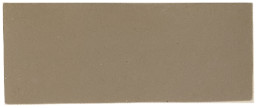 |
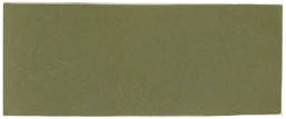 |
 |
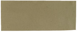 |
 |
 |
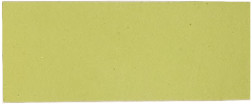 |
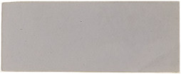 |
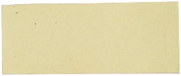 |
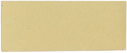 |
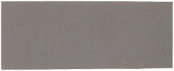 |
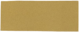 |
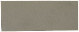 |
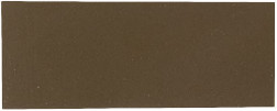 |
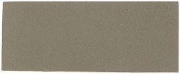 |
 |
[81]
It will be unnecessary to describe in detail how every brush is made, but an ordinary ground brush will serve as an example. The actual manufacture is not difficult. First the bristles are carefully weighed out so that every brush of the same grade has exactly the same quantity of bristle in it as a corresponding brush; great care being taken not to disturb the way in which the bristles lie. They must all point one way, and naturally they have a certain bend. The outside of the brush is usually made of white bristles, while the inside is grey and yellow. This is almost a universal rule, for although the inside bristles are of equal spring to those outside, still trade demands white bristles outside and has them. The reader will understand that the bristles that are to form the ground brush about to be made are lying on the scale, these having been weighed they are taken off, the white bristles being underneath, so as to form the outside of the brush. The workman takes all the bristles carefully, but firmly, in both hands, and turns the bristle round his thumb in such a way that the bend of the bristles all turn inward towards the centre, and the white bristles or ‘cappings’ lie in an even rim round the rest, and the ‘knot’ is then tied round with string. The knots are then dipped in hot cement and kept warm standing upon a hot plate.
The next process is ‘driving,’ which consists in forcing the handle through the bristles, which has been previously inserted in its binding, and this tightens the brush by compression.
Varnish brushes, as a rule, are shaped in a manner somewhat similar to the method of making artists’ pencils, that is to say, the wedge shape is produced by placing the bristles into a small circular box, the bottom of which is concave. Hence, it will be seen that the bristles, if even they are all of the same length, have the necessary chisel-edge for a varnish brush. Pegged brushes are made under a patent of Messrs. G. B. Kent & Sons. Speaking roughly, it consists of driving pegs into the back woodwork of the brush so as to throw the parts into greater compression and to hold the bristles tighter. After the brush is made, the bristles are thoroughly scoured on a stone with soap and water. After the brush is finished, the bleaching chambers are reached where, by means of sulphurous fumes, the bristles are bleached to the required degree of whiteness.
—However good a brush may be it will soon be ruined unless it is properly treated when out of use. The following hints will suffice as a guide in this respect:—
Writing Pencils, etc.—Wash in turpentine until quite clean, and if they are not to be used for some time dip in olive oil and smooth from heel to point.
[82]

RED SABLE.
Stipplers.—Wash thoroughly in pure soap and hot water rinsing with cold water. Place point downwards to dry.
STIPPLER, WITH BRIDGE HANDLE.
Varnish Brushes.—The best method of keeping varnish brushes, in the opinion of the author, is to suspend them in the same description of varnish as that they are used for. As this is not always possible boiled oil may be used instead.

VARNISH BRUSH—GALVD. WIRE BOUND.
Paint Brushes.—Mr. Ernest N. Kent gives the following instructions in “Specifications”:—

SASH TOOL.

FLAT OVAL GROUND BRUSH.
Brushes made for Use in Colour should first be soaked well[83] in water to swell the bristle in the binding. This applies also to whitewash brushes which are bound either by wire or leather.
A Brush after Use should be thoroughly cleansed out in turps or soap and water. If left in water any length of time they are liable to twist, and the bristles lose their elasticity.
A Brush made for Paint should not be used in varnish, the spirit of which dissolves the cement with which it is set, and loosens the bristles. When a ground brush has been well worn down in colour, it may, however, be used in varnish.
A Brush made for Varnish must on no account be put into water as the water destroys the cement.
Varnish Brushes when not in use should be suspended in either varnish or oil, the brush not resting on the bristles. No brushes should on any account be kept in turpentine.
Stippling Brushes should be well cleaned and dried after use, the bristle being carefully kept from crushing; a box in which they can be slid, allowing the bristle to hang downwards is recommended.
Should a Brush become quite hard with Paint it should be soaked for twenty-four hours in raw linseed oil, after which time in hot turpentine.
—Take 2lbs. of ground litharge, 2lbs. of red lead, 1lb. of sulphate of manganese, 1⁄2lb. of sugar of lead. Mix these to a paste with light coach japan, put the paste into a gallon jar and add half a gallon of pure turpentine. Let this stand for three days, stirring occasionally, then pour off the resultant liquid which forms first-class terebine. You can afterwards pour in another half gallon of turps, well stir and pour off as before. This can be done a third time when the chemicals will have become exhausted.
—A cement suitable for filling up defects in cast iron is made by mixing one part of bone black, one part of powdered gum arabic, one part iron dust or very fine iron filings, and two parts of plaster of Paris. This powder is made up into a stiff body[84] with water, but only sufficient for immediate use should be made, as it sets very rapidly. In time it becomes as hard as iron.
—The following mixture will produce an excellent buff paint for ordinary purposes. Grind in raw linseed oil 3cwt. of white lead, 4cwt. of grey barytes, 8lbs. of genuine red oxide, 100lbs. of J.F.L.S. ochre, and 8lbs. burnt Turkey umber.
—Grind together 5cwt. of grey barytes, 1cwt. Paris white, 4cwt. of French ochre, and 4lbs. of genuine red oxide of iron.
—Dissolve rosin in an equal bulk of naphtha and colour with lamp black for black, celestial blue for blue, Venetian red for red, and so on. A little oil added will be of assistance.
—Dissolve asphaltum in spirits of turpentine and thin down to the required consistency.
This class of paint is much used in America, and they are made in a variety of colours. The necessary qualities are great durability under wear. Three coats are usually given, but it is very necessary that sufficient time be allowed to elapse between the application of each coat to enable a thorough drying to be effected. The thinners for each recipe will be the same, namely, gloss oil twenty gallons, linseed oil eight gallons, turpentine japan six gallons, benzine japan two gallons, turpentine four gallons, benzine three gallons, making together 52 gallons. The pigments will be as follows:
—Yellow ochre, 175lbs.; whiting, 25lbs.; zinc, 25lbs.; Portland cement, 3lbs.
—Zinc white, 175lbs.; white lead, 25lbs.; whiting, 50lbs.; lamp black, 1lb.; yellow ochre, 8lbs.
—The same as dust colour, excepting that 5lbs. of lamp black should be used and 3lbs. of yellow ochre.
—Yellow ochre, 100lbs.; Venetian red, 17lbs.; zinc, 25lbs.; whiting, 70lbs.
—Indian red, 100lbs.; Venetian red, 50lbs.; zinc, 25lbs.; whiting, 25lbs.
—Yellow ochre, 100lbs.; whiting, 70lbs.; mineral brown, 15lbs.; zinc, 25lbs.; Venetian red, 6lbs.
[85]
This class of paints is much used in the United States, the article that is to be painted being dipped into the paint so as to save the labour of applying it with a brush in the ordinary manner.
—In this case two separate dippings are required, first with the following mixture which acts as a primer. Take 100lbs. of dry ground slate, 100lbs. of whiting, 50lbs. of zinc white, 2 gallons of linseed oil, 20 gallons of gloss oil, and 5 gallons of benzine. These being properly mixed form a priming coat which dries fairly quickly. When dry dip the article into a paint made of the following mixture: 25lbs. of drop black, 31⁄2 gallons of grinding japan, half gallon of turpentine, 71⁄2 gallons gloss oil, and one gallon of turpentine.
—A primer is made by grinding together 14lbs. of golden ochre, 11⁄2 gallons of grinding japan, 2 gallons of gloss oil, and half gallon of turpentine. The paint is made of 30lbs. of medium chrome yellow, 2 gallons of grinding japan, 11⁄2 gallons of turpentine, and 7 gallons of gloss oil. This makes 12 gallons of paint.
—Grind together 80lbs. of bright scarlet or Turkey red, 80lbs. best Paris white, 38 gallons gloss oil, 4 gallons of benzine, 2 gallons of linseed oil, and 2 gallons of benzine japan. This makes 50 gallons of paint.
—Grind together 100lbs. of dry ground slate, 25lbs. zinc white, 1 gallon of linseed oil, 2 gallons of gloss oil, and 1 gallon of japan drier.
—Grind 100lbs. of zinc white with 90lbs. of Paris white in 2 gallons of linseed oil, 32 gallons of gloss oil, and 11 gallons of benzine. This makes 50 gallons of paint.
The above recipes for dipping paints have been modified from recipes which originally appeared in “Drugs, Oils and Paints,” of Philadelphia.
There has been a very considerable amount of difference of opinion as to the best paint for iron. An elaborate course of experiments were made and the results reported in the columns of the “Engineer” some time since. The results of these[86] experiments showed that no rust whatever resulted from either of the following mixtures, which may therefore be recommended as good paints for iron.
—Red lead, 88 parts; raw linseed oil, 12 parts.
—Cheaper red lead, 45 parts; barytes, 45 parts; raw linseed oil, 10 parts.
—Very cheap red lead, 22 parts; barytes, 66 parts; raw linseed oil, 12 parts.
—Barytes, 33 parts; deep vermilionette, 44 parts; pale vermilionette, 14 parts; raw linseed oil, 7 parts.
—Permanent red, 88 parts; raw linseed oil, 7 parts.
Although an ordinary putty is made of dry whiting with raw linseed oil, a modification of this mixture is often necessary and desirable.
—One pound of white lead mixed with 10lbs. of whiting and ground with the necessary quantity of boiled linseed oil makes an excellent putty. About half a gill of best olive oil or cotton seed oil added, prevents the white lead from hardening and preserves the putty in a state sufficiently soft to adhere at all times.
—The above recipe answers for putty that is to be sent abroad, the cotton oil preventing it from going hard. Sometimes the white lead is omitted.
—A very strong putty is made of boiled oil and whiting and is suitable for exposed positions, such as skylights. It is not adapted for keeping, as it gets too hard. Putty for inside work that is ground in raw linseed oil may be made by adding a little white lead.
—Mix dry red lead with boiled oil and turpentine varnish. This may be used immediately, as it soon gets hard.
—Boil 7 parts of linseed oil with four parts of brown umber for two hours. Then add 51⁄2 parts of whiting and 11 parts of white lead and mix the whole. This putty is very durable and adheres well to wood.
[87]
—Various recipes for a so-called imperishable putty have been given. The one published above, named French putty, is very durable, but it may be varied by boiling together for two hours 31⁄2lbs. of linseed oil and 2lbs. of brown umber. Stir in one ounce of beeswax, take off the fire, and mix 2³⁄4lbs. of whiting and 51⁄2lbs. of white lead.
—Dissolve glue in water and add as much very fine sawdust as may be required.
—Mix 5 oz. of lamp black and 3 oz. of superfine flour of emery in half a gallon of shellac varnish or patent knotting. This gives a fine slating. Shellac varnish may be made by dissolving 1lb. of orange shellac in half a gallon of methylated spirits. Another recipe is: Dissolve 1lb. shellac in one gallon of methylated spirits. When dissolved add 1lb. best ivory black, 5 oz. of best flour of emery. Mix and put in a stoppered bottle, shake well before using. In applying this it must be done rapidly, and only a little of the paint should be poured out at a time, as the spirit rapidly evaporates. In applying it to old blackboards one coat is usually sufficient.
—In order to prevent the breeding of vermin the whitewash used for poultry houses should be mixed with a little gas tar—not coal tar. It may be obtained at any gas works, and should be used in the proportion of about a quarter of a pint to the pailful of ash. To bind the whitewash, flour made into a paste with hot water may be used, and is better than glue size as it does not decay and will not injure the fowls.
An excess of driers in paint often gives rise to blistering.
Boiled oil, if of good quality, will, when applied to glass, dry in 24 hours.
Tar should always be applied hot.
[88]
Dark boiled oil may be pure, but it will not produce good work.
A little varnish added to paint, often improves both its appearance and durability.
In painting over bad stains, tar, etc., a coat of shellac varnish will usually give a good surface on which the paint will dry.
Ochre makes a good and cheap priming coat, if it is very fine.
To test patent driers, mix it with raw linseed oil, in the proportion of one to three, and apply to glass. If still tacky at the end of 24 hours, the driers may be looked upon as being of inferior quality.
Varnish brushes are best kept, when not in use, by being suspended in the same kind of varnish in which they are ordinary used.
For thinning gold size, use a little boiled oil, not turpentine.
The practical painter should have an “educated” nose—that is, one that can at once detect adulteration in oil and turpentine.
To mix varnishes is sometimes necessary, when the particular kind required is not at hand. But it is always a bad plan, and is never desirable. When it must be done, do not use the varnish for a few days.
An even temperature is of the greatest importance in obtaining good results from varnish. Coach painters’ shops are usually kept exactly at the same heat, while dust and draughts of cold air are rigidly excluded. This is one of the reasons why coach painters are able to turn out such fine work.
Success in repainting ironwork largely depends in removing all[89] rust, scale, etc. For this purpose, wire brushes should be used, as they greatly facilitate the operation.
Luminous paint which, if exposed to the light during the day, will give off sufficient light at night time to enable one to see the time by a watch, may be had to last several years, if protected by a piece of glass from the weather, and it is extremely useful for certain positions where it is not desired to burn a light.
Fineness of grinding is a most important quality of all tinting colours, but in none more so than in the umbers and siennas prepared for grainer’s use. It is of equal importance that the tone and colour be pure. Sometimes this class of colours are toned up with chrome, but this is objectionable, and the right tone of sienna can only be expected when the correct quality of crude earth is selected.
Tube colours are now becoming so popular among the highest class painters and decorators that the use of dry colours will soon be considered obsolete. When the colours are put in tubes, waste is almost wholly prevented, while their use keeps the colours moist for a considerable time.
Two coats of patent knotting or shellac varnish may be given to cover stains, damp spots, or other work which will not take the paint. Even tar spots thus treated may be neutralized.
Grained work should never be varnished until after 6 or 7 days from the time it is finished. This delay will render the surface much more durable than it would be if varnished immediately.
Spring and summer are not the best for painting, as many suppose. The autumn is better, as the work is then, as a rule, thoroughly dry and in the best condition to take the paint.
To obscure window glass, the best plan is to apply a coat of matting varnish, which is specially made for the purpose. It looks[90] very neat, and effectively obscures the glass, although it shuts out very little of the light.
A rough way of testing a brush is to pluck a few bristles and to burn them by applying a match. If they are true bristles they will give off an unmistakable odour, will frizzle up while burning, but will not leave an ash. Fibre, on the other hand, burns without smell, and leaves an ash.
Embossing on glass is usually done by means of hydrofluoric acid. The design is pounced or sketched on with French chalk. Then every part that is not to be embossed is painted over with a special Brunswick black. A little wall of tallow is then built all around the pane of glass laid flat, and the acid is gently poured on. In about half an hour it has eaten into the glass sufficiently to form a well-defined pattern. The acid is poured off into a guttapercha bottle, the tallow removed, and the surface washed with clean water. The black is softened with turpentine and removed by means of an old chisel.
A priming coat can never prove satisfactory unless it is composed of very fine materials. White lead, red lead, or white lead and ochre are among the best primers.
The best tests of linseed oil for the practical man are the senses of smell and taste. The analysis of linseed oil is a very difficult process, and every oil dealer should educate his senses by constant practice and recognise the pure oil immediately when he smells or tastes it. Adulteration in boiled oil is more difficult to detect than it is in raw oil.
Never mix two different kinds of driers in a paint; they may re-act upon one another and actually retard the drying of the paint.
Too much driers in paint will destroy its durability and may affect the gloss.
[91]
Messrs. Wilkinson, Heywood & Clark, Ltd., 7, Caledonian Road, London, N., have favoured the author with samples of their colours, which he finds, after examination, to be of a high order of excellence. Their white oil varnish is also highly recommended, being almost colourless and not turning yellow.
In preparing plaster figures for showing samples of gold paint it is necessary first to give a heavy coat of shellac to prevent absorption.
Perhaps not one painter in a thousand knows that water glass (silicate of soda) makes an excellent size for wall paper. It will not wash up the pattern, and it forms a foundation for the paper varnish that makes it stand out admirably.
The priming coat for new pine may be made by mixing a stone of white lead in oil with an equal quantity of patent driers. About one pound of turpentine and a pound and a half of raw linseed oil will be required.
—As already stated we cannot spare room to deal with this important subject, but may give one or two notes on the subject. The following is a useful list taken from “Colour,” by George H. Hurst. A somewhat similar list will be found in “Colour” by Professor A. H. Church. The names and addresses of the publishers of these two books are given on another page.
—
| Crimson | and | orange | Bad. |
| „ | „ | yellow | Inferior. |
| „ | „ | green | Strong, but harsh. |
| „ | „ | blue | Good. |
| „ | „ | violet | Bad. |
| „ | „ | gold-yellow | Good. |
| Scarlet | and | yellow | Bad. |
| „ | „ | green | Inferior. |
| „ | „ | greenish-blue | Good.[92] |
| Scarlet | and | blue | Good. |
| „ | „ | violet | Bad. |
| Orange | and | yellow | Poor. |
| „ | „ | yellow-green | Fair. |
| „ | „ | green | Strong-poor. |
| „ | „ | green-blue | Fair. |
| „ | „ | blue | Good. |
| „ | „ | violet | Strong-good. |
| Orange-yellow | and | crimson | Poor. |
| „ | „ | scarlet | Poor. |
| „ | „ | green | Bad. |
| „ | „ | blue-green | Bad. |
| „ | „ | green-blue | Fairly good. |
| „ | „ | blue | Excellent. |
| „ | „ | violet | Good. |
| Yellow | and | crimson | Poor. |
| „ | „ | green | Bad. |
| „ | „ | blue-green | Very bad. |
| „ | „ | blue | Only fair. |
| „ | „ | violet | Very good. |
| Green | and | blue | Very poor. |
| „ | „ | violet | Moderate. |
| „ | „ | red | Good. |
The author has thought it might be of service to his readers to include a list of books which would probably be useful to the purchaser of this work. The list below includes the most modern and up-to-date works, together with their prices and publishers. A very brief description is appended.
PAINTING & DECORATING, by Walter J. Pearce, second edition, 1902. Price, 12s. 6d. Published by Chas. Griffin & Co., Ltd., London. This is a book of 312 pages and several coloured plates. The first edition was published in 1898, and it contains information on every branch of house painting and decorating. It is the work of a practical painter, who is also an artist, and[93] who has lectured on the subject at the Manchester Technical School for several years past. The book is highly recommended.
PAINTERS’ COLOURS, OILS & VARNISHES, a Practical Manual by George H. Hurst, F.C.S. This work contains over 500 pages. The third edition was published in 1901 by Chas. Griffin & Co., Ltd., Exeter Street, Strand, E.C. The book contains detailed information of the most practical and thorough character concerning all pigments, colours, colour and paint machinery, paint vehicles, such as paint oils, turpentine, etc., driers and varnishes. As a manual treating of painters’ materials it will be found most useful to painters who desire to know the properties of the materials they use.
PRANG’S “STANDARD OF COLOUR.” This work is very useful to colour mixers. It consists of seven plates, each plate consisting of 168 colours, tints or hues. (Arthur Ackerman, Regent Street, S.W.)
“HOUSE PAINTING, GRAINING, MARBLING AND SIGN WRITING,” by Ellis A. Davidson. This book comprises 9 coloured plates of wood and marbles, 150 wood engravings and a full treatise on the process of house painting, sign writing, etc. (Crosby, Lockwood & Son.)
“CHEMISTRY OF PAINTS AND PAINTING,” by Professor A. H. Church, published by Seeley & Co., Gt. Russell Street, W.C. This is a reliable and exhaustive treatise on pigments, oils, varnishes and other materials used by artists.
“PIGMENTS, PAINT AND PAINTING,” by George Terry, published by Messrs. E. & F. N. Spon, Ltd., London, 7s. 6d.
“MANUFACTURE OF PAINTS,” by J. Cruickshank Smith, B.S.A., published by Scott, Greenwood & Co., London, 7s. 6d.
“COLOUR.” A handbook of the theory of colour by George H. Hurst, F.C.S., with 10 coloured plates and 22 illustrations. Published by Scott, Greenwood & Co., London, 7s. 6d.
“COLOUR.” A text book of modern chromatics, with application to art and industry, by Professor Ogden Rood, 3rd edition, 5s.
[94]
“COLOUR.” An elementary manual for students, with 6 coloured plates, by Professor A. H. Church. Published by Cassell & Co.
“THE MODERN WOOD FINISHER,” by F. Maire. This is a thoroughly practical little work on Wood Finishing in all its branches. Price 2s. Published by “The Western Painter,” Journal Building, Chicago, Ill., U.S.A.
The Author regrets that in the text the address of Messrs. Torrance & Sons, Ltd., is given incorrectly. It should be Bitton, near Bristol, Glos.

[i]

M. Waller & Son, Printers, 15, Chapal Lane, Hull.
[iv]
“ECLIPSE”
PAINT REMOVER.
Saving of 50 per Cent. in Time and Labour. No Lime or Potash.
To Railway and Gas Companies, Shipowners, Builders, Decorators, Coachbuilders, Painters, Ship and Yacht Builders, etc.
No 1. The “Eclipse” Paint Remover.
This Powerful Paste is invaluable for Removing Old Hard Paint (any thickness), Enamel, Varnish, and Wall Paper from Wood, Stone, or Iron. It is a Disinfectant, and will not injure the Surface nor the Paint or Varnish afterwards applied, and is pronounced by first-class Firms to be the Cheapest and most Effectual in the Market. It is much liked for taking paint from Baths for repainting, and is invaluable as applied to old wood carvings and all fine-art work. Will thoroughly clean and renew Marble, etc.
☛ Send for Circular and Testimonials to
JOHN M. GIBSON,
21, HOPE STREET, GLASGOW.
[IN PRESS.]
WALL PAPER AND PAPERHANGING.
By ARTHUR S. JENNINGS.
A Handbook on Decoration in paper and other materials, with
practical instructions on Hanging them.
Illustrated by many half-tone and other engravings, showing the latest designs in Wall Hangings.
Price 5s. Post free, 5s. 3d.
May be had of the Author, A. S. JENNINGS, 62, Barry Road,
East Dulwich, London, S.E.
Advertisement as illustration.
[v]
THE RIPON & CLARO VARNISH CO.
Works: RIPON.
Manufacturers of High-class Varnishes, Japans, Paints, Colours, etc.,
FOR EVERY PURPOSE.
Specialities:
QUICK DRYING READY BOUND COLOURS IN TURPS.,
REQUIRE NO GOLD SIZE OR MIXING.
Drop Ivory Black, Chromes, Greens, Blues, Reds, etc.
Command an Enormous Sale.
SMITH’S PATENT.
A New Tool for Painters, Paint Manufacturers, and others for Cleaning Out Paint Cans, Drums, Kegs, and the like. Will last for years, and is a useful addition to a Painter’s Outfit. A Good Mixer. Handy for Cleaning Gutters, Scraping Ironwork, Burning Off, and lots of other purposes.
POST FREE, 1s. 9d.
H. SMITH,
HALE ROAD BRIDGE, ALTRINCHAM, CHESHIRE.
THE
“LITTLE GIANT”
PAINT MIXER.
The wood-cut on page 9 of this work shows a useful Paint Mixer for hand power, called the “Little Giant.” The advantage of this Machine is that it can be taken to the spot where the Paint is required, and any quantity up to five gallons mixed in a few minutes. The drum can be removed for distributing the Paint by pulling down the lever. The size of the container is 15-in. × 10-in., and is interchangeable. The weight of the “Little Giant” is 31⁄2-cwts. when complete. The machine should be of great use to those having to mix Paint where work is being done, and should appeal specially to Builders, Shipbuilders, and Engineers.
TORRANCE &SONS, LIMITED,
BITTON, NEAR BRISTOL.
[vi]
The Illustrated Carpenter & Builder
THE BEST JOURNAL FOR
ARCHITECTS, DECORATORS, PAINTERS, PLUMBERS,
JOINERS, GASFITTERS, AND MECHANICS
IN ALL TRADES.
☛ Indispensable to Every Workman, and Interesting to Every Amateur.
One Penny Weekly. Monthly Parts, 6d.
THE CARPENTER AND BUILDER
TECHNICAL . .
. . . . SERIES.
Now Ready:
BRICKLAYING,
SCAFFOLDING,
SLATING,
HOME HANDICRAFTS,
PAINTING AND VARNISHING,
MASONRY,
PLASTERING,
CARPENTRY.
In Preparation:
ARTIFICIAL STONE,
TERRA COTTA, &c.,
CONCRETE,
JOINERY,
DECORATING,
PLUMBING.
Edited by JOHN BLACK, Editor of the I. C. and B.
PRICE SIXPENCE.
Each Volume Well Printed and Profusely Illustrated. Off all Newsagents, Stationers, Booksellers, and Bookstalls, and (71⁄2d. Post Free)
JOHN DICKS, 313, STRAND, LONDON, E.C.
Advertisement as illustration.
[vii]
Telegraphic Address:
“JAPANNING, MITCHAM.”
Chas. H. Blume,
Western Road,
Mitcham,
HIGH-CLASS
Surrey.

VARNISHES, JAPANS
ENAMELS and COLOURS.
SPECIALITIES:
Blume’s Secoline Driers.
Less acute than Terebine; the use of Secoline in Paints warrants their absolute hardening in as short a time as possible without injury to the elasticity and wear of the paint.
‘Ambra’ Oil Varnish Stain.
Durability incomparably greater than that of Spirit Varnish Stain.
The ‘Aristo’ White African Copal Varnish.
Paler than French Oil. The whitest, choicest Copal Oil Varnish made. Warranted free from Damar, yet water white in colour. For inside and outside use. Price 30/- per gall. Special quotations for quantities.
Blume’s Special Liquid Woodfiller,
Write for Catalogue, Price List and Samples.
Advertisement as illustration.
[viii]
☛ YOU SHOULD TRY
BALL’S
Instantaneous Varnish
and Paint Remover
(By Royal Letters Patent).
IT SAVES TIME! IT SAVES MONEY!
For first-class work it gives best results, and for cheap work it is really a money-saver. It does its work in a manner that no other material known to painters can do. Work done with Ball’s I.V.R. is ready for re-coating at once, with a beautiful smooth surface.
No Washing Down with Water Required.
This material is SOLD under the ABSOLUTE GUARANTEE that it will LEAVE NO BAD AFTER-EFFECTS, nor—MOST IMPORTANT POINT OF ALL—will it ever work through any of the succeeding coats.
To Decorators, Coach Painters and Hardwood workers this material is simply indispensable.
Send for Circular to PATENTEE and MANUFACTURER,
WM. MITCHELL,
39, Nairn Street, KIRKCALDY, N.B.
Sample Gallon, 12/- Carriage Paid.
Advertisement as illustration.
[ix]
ELLAM, JONES & CO., LTD.,. .
Varnish, Paint and Colour Manufacturers,
MARKEATON MILLS, DERBY.
ESTABLISHED NEARLY A CENTURY.
SPECIALITIES:
MARKEATON RED.
A perfect substitute for Vermilion, used exclusively by the Midland, Great Central, Hull and Barnsley Railway Companies for their signal arms, and by nearly all the Corporations in the United Kingdom for their Fire Appliances.
In Washington Bags of 30lbs. at 1/6 per lb. The most reliable Permanent
Red on the market.
“ ELLAMITE. ”
A PAINT ABSOLUTELY UNIQUE.
It is of the appearance of silver, may be applied to the roughest iron or to any surface—covers splendidly—goes far. It is quite durable both inside and OUTSIDE, and costs only 20/- a gallon nett., in 1⁄2 gallon tins, free; and also in 1/- and 2/- tins, subject.
This preparation is made by a process of electrolysis.
Railings, iron gates, &c., look splendid when painted with it.
Painters and decorators all over the country are taking it up. Specified for many important works, including Great Yarmouth New Britannia Pier, Yarmouth Aquarium, &c.
CHROMATE OF ZINC, STEEL BLUE, etc.
ORIGINAL MANUFACTURERS OF OXIDE OF IRON.
SAMPLES ON APPLICATION TO
ELLAM, JONES & CO., Ltd.,
. . Paint, Colour and Varnish Manufacturers, . .
MARKEATON MILLS, DERBY.
Advertisement as illustration.
[x]
ZINGESSOL,
Orr’s New Washable Distemper.
Fast Colours,
SUPERSEDING
ALL OTHERS.
Artistic,
WARRANTED FREE
FROM LIME.
Economical.
Durable as Oil Paint for Inside or Outside Work, and
much less expensive.
It is a happy combination of the old Italian Gesso ground with a zinc preparation, and not only non-poisonous, but a valuable Sanitary Agent.
A well-chosen Wall Decoration in Zingessol is an art education to those accustomed only to coloured washes or tawdry papers.
☛ Price List, Patterns of Stock Colours, &c., will be sent on application to the Manufacturers:
ORR’S ZINC WHITE LTD.
Widnes, Lancashire.
OR TO THEIR AGENTS.
Telegrams: “ORR, WIDNES.”
Advertisement as illustration.
G·B·KENT·&·SONS
BEST·BRITISH·BRUSHES
ESTABLISHED IN 1760.
LEWIS BERGER
and SONS limited
Manufacturers of
PAINTS, COLOURS,
and VARNISHES.
Specially Prepared Lines for
DECORATORS SIGN·WRITERS &c
write for samples & particulars
Homerton, London, N.E.
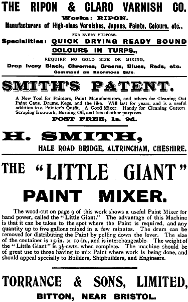



Inconsistent spelling (including that of proper names), punctuation, lay-out and formatting have been retained, unless mentioned below.
The differences in wording between the table of contents and the text have not been standardised; except as mentioned under Changes below, chapter and (sub-)section headings in the text are based on the text rather than on the table of contents.
Because of the difficulty to calibrate the named (mixed) colours, the colour samples provided have been copied straight from the scans, without any colour correction or contrast or brightness adjustments. See also the section on The Nomenclature of Colours.
The advertisements for Lewis Berger and Sons and for Wilkinson Heywood & Clark were partly covered by library stickers; these have been removed, but left blank spaces.
The inconsistencies in the Index have not been corrected.
Depending on the hard- and software used and their settings, not all elements may display as intended.
Page 41: Naples yellow is mentioned twice, possibly one mention is erroneous.
Changes made
Some obvious punctuation and typographical errors have been corrected silently.
Page 7: Venetian read changed to Venetian red
Page 37: Torquoise Blue changed to Turquoise Blue
Page 60: Chapter title How to Test the Quality of Colours inserted cf. table of contents.
Page 74: Chapter title Recipes, Tables, Hints and Notes inserted cf. table of contents.
Page 86: Putty for inside wook changed to Putty for inside work
Page 88: In printing over bad stains changed to In painting over bad stains
Page i: Birdseye changed to Bird’s Eye as in text.
End of Project Gutenberg's Paint & Colour Mixing, by Arthur Seymour Jennings

*** END OF THIS PROJECT GUTENBERG EBOOK PAINT & COLOUR MIXING ***

***** This file should be named 56738-h.htm or 56738-h.zip *****
This and all associated files of various formats will be found in:
        http://www.gutenberg.org/5/6/7/3/56738/

Produced by Chris Curnow, Harry Lamé and the Online
Distributed Proofreading Team at http://www.pgdp.net (This
file was produced from images generously made available
by The Internet Archive)


Updated editions will replace the previous one--the old editions will
be renamed.

Creating the works from print editions not protected by U.S. copyright
law means that no one owns a United States copyright in these works,
so the Foundation (and you!) can copy and distribute it in the United
States without permission and without paying copyright
royalties. Special rules, set forth in the General Terms of Use part
of this license, apply to copying and distributing Project
Gutenberg-tm electronic works to protect the PROJECT GUTENBERG-tm
concept and trademark. Project Gutenberg is a registered trademark,
and may not be used if you charge for the eBooks, unless you receive
specific permission. If you do not charge anything for copies of this
eBook, complying with the rules is very easy. You may use this eBook
for nearly any purpose such as creation of derivative works, reports,
performances and research. They may be modified and printed and given
away--you may do practically ANYTHING in the United States with eBooks
not protected by U.S. copyright law. Redistribution is subject to the
trademark license, especially commercial redistribution.

START: FULL LICENSE

THE FULL PROJECT GUTENBERG LICENSE
PLEASE READ THIS BEFORE YOU DISTRIBUTE OR USE THIS WORK

To protect the Project Gutenberg-tm mission of promoting the free
distribution of electronic works, by using or distributing this work
(or any other work associated in any way with the phrase "Project
Gutenberg"), you agree to comply with all the terms of the Full
Project Gutenberg-tm License available with this file or online at
www.gutenberg.org/license.

Section 1. General Terms of Use and Redistributing Project
Gutenberg-tm electronic works

1.A. By reading or using any part of this Project Gutenberg-tm
electronic work, you indicate that you have read, understand, agree to
and accept all the terms of this license and intellectual property
(trademark/copyright) agreement. If you do not agree to abide by all
the terms of this agreement, you must cease using and return or
destroy all copies of Project Gutenberg-tm electronic works in your
possession. If you paid a fee for obtaining a copy of or access to a
Project Gutenberg-tm electronic work and you do not agree to be bound
by the terms of this agreement, you may obtain a refund from the
person or entity to whom you paid the fee as set forth in paragraph
1.E.8.

1.B. "Project Gutenberg" is a registered trademark. It may only be
used on or associated in any way with an electronic work by people who
agree to be bound by the terms of this agreement. There are a few
things that you can do with most Project Gutenberg-tm electronic works
even without complying with the full terms of this agreement. See
paragraph 1.C below. There are a lot of things you can do with Project
Gutenberg-tm electronic works if you follow the terms of this
agreement and help preserve free future access to Project Gutenberg-tm
electronic works. See paragraph 1.E below.

1.C. The Project Gutenberg Literary Archive Foundation ("the
Foundation" or PGLAF), owns a compilation copyright in the collection
of Project Gutenberg-tm electronic works. Nearly all the individual
works in the collection are in the public domain in the United
States. If an individual work is unprotected by copyright law in the
United States and you are located in the United States, we do not
claim a right to prevent you from copying, distributing, performing,
displaying or creating derivative works based on the work as long as
all references to Project Gutenberg are removed. Of course, we hope
that you will support the Project Gutenberg-tm mission of promoting
free access to electronic works by freely sharing Project Gutenberg-tm
works in compliance with the terms of this agreement for keeping the
Project Gutenberg-tm name associated with the work. You can easily
comply with the terms of this agreement by keeping this work in the
same format with its attached full Project Gutenberg-tm License when
you share it without charge with others.

1.D. The copyright laws of the place where you are located also govern
what you can do with this work. Copyright laws in most countries are
in a constant state of change. If you are outside the United States,
check the laws of your country in addition to the terms of this
agreement before downloading, copying, displaying, performing,
distributing or creating derivative works based on this work or any
other Project Gutenberg-tm work. The Foundation makes no
representations concerning the copyright status of any work in any
country outside the United States.

1.E. Unless you have removed all references to Project Gutenberg:

1.E.1. The following sentence, with active links to, or other
immediate access to, the full Project Gutenberg-tm License must appear
prominently whenever any copy of a Project Gutenberg-tm work (any work
on which the phrase "Project Gutenberg" appears, or with which the
phrase "Project Gutenberg" is associated) is accessed, displayed,
performed, viewed, copied or distributed:

  This eBook is for the use of anyone anywhere in the United States and
  most other parts of the world at no cost and with almost no
  restrictions whatsoever. You may copy it, give it away or re-use it
  under the terms of the Project Gutenberg License included with this
  eBook or online at www.gutenberg.org. If you are not located in the
  United States, you'll have to check the laws of the country where you
  are located before using this ebook.

1.E.2. If an individual Project Gutenberg-tm electronic work is
derived from texts not protected by U.S. copyright law (does not
contain a notice indicating that it is posted with permission of the
copyright holder), the work can be copied and distributed to anyone in
the United States without paying any fees or charges. If you are
redistributing or providing access to a work with the phrase "Project
Gutenberg" associated with or appearing on the work, you must comply
either with the requirements of paragraphs 1.E.1 through 1.E.7 or
obtain permission for the use of the work and the Project Gutenberg-tm
trademark as set forth in paragraphs 1.E.8 or 1.E.9.

1.E.3. If an individual Project Gutenberg-tm electronic work is posted
with the permission of the copyright holder, your use and distribution
must comply with both paragraphs 1.E.1 through 1.E.7 and any
additional terms imposed by the copyright holder. Additional terms
will be linked to the Project Gutenberg-tm License for all works
posted with the permission of the copyright holder found at the
beginning of this work.

1.E.4. Do not unlink or detach or remove the full Project Gutenberg-tm
License terms from this work, or any files containing a part of this
work or any other work associated with Project Gutenberg-tm.

1.E.5. Do not copy, display, perform, distribute or redistribute this
electronic work, or any part of this electronic work, without
prominently displaying the sentence set forth in paragraph 1.E.1 with
active links or immediate access to the full terms of the Project
Gutenberg-tm License.

1.E.6. You may convert to and distribute this work in any binary,
compressed, marked up, nonproprietary or proprietary form, including
any word processing or hypertext form. However, if you provide access
to or distribute copies of a Project Gutenberg-tm work in a format
other than "Plain Vanilla ASCII" or other format used in the official
version posted on the official Project Gutenberg-tm web site
(www.gutenberg.org), you must, at no additional cost, fee or expense
to the user, provide a copy, a means of exporting a copy, or a means
of obtaining a copy upon request, of the work in its original "Plain
Vanilla ASCII" or other form. Any alternate format must include the
full Project Gutenberg-tm License as specified in paragraph 1.E.1.

1.E.7. Do not charge a fee for access to, viewing, displaying,
performing, copying or distributing any Project Gutenberg-tm works
unless you comply with paragraph 1.E.8 or 1.E.9.

1.E.8. You may charge a reasonable fee for copies of or providing
access to or distributing Project Gutenberg-tm electronic works
provided that

* You pay a royalty fee of 20% of the gross profits you derive from
  the use of Project Gutenberg-tm works calculated using the method
  you already use to calculate your applicable taxes. The fee is owed
  to the owner of the Project Gutenberg-tm trademark, but he has
  agreed to donate royalties under this paragraph to the Project
  Gutenberg Literary Archive Foundation. Royalty payments must be paid
  within 60 days following each date on which you prepare (or are
  legally required to prepare) your periodic tax returns. Royalty
  payments should be clearly marked as such and sent to the Project
  Gutenberg Literary Archive Foundation at the address specified in
  Section 4, "Information about donations to the Project Gutenberg
  Literary Archive Foundation."

* You provide a full refund of any money paid by a user who notifies
  you in writing (or by e-mail) within 30 days of receipt that s/he
  does not agree to the terms of the full Project Gutenberg-tm
  License. You must require such a user to return or destroy all
  copies of the works possessed in a physical medium and discontinue
  all use of and all access to other copies of Project Gutenberg-tm
  works.

* You provide, in accordance with paragraph 1.F.3, a full refund of
  any money paid for a work or a replacement copy, if a defect in the
  electronic work is discovered and reported to you within 90 days of
  receipt of the work.

* You comply with all other terms of this agreement for free
  distribution of Project Gutenberg-tm works.

1.E.9. If you wish to charge a fee or distribute a Project
Gutenberg-tm electronic work or group of works on different terms than
are set forth in this agreement, you must obtain permission in writing
from both the Project Gutenberg Literary Archive Foundation and The
Project Gutenberg Trademark LLC, the owner of the Project Gutenberg-tm
trademark. Contact the Foundation as set forth in Section 3 below.

1.F.

1.F.1. Project Gutenberg volunteers and employees expend considerable
effort to identify, do copyright research on, transcribe and proofread
works not protected by U.S. copyright law in creating the Project
Gutenberg-tm collection. Despite these efforts, Project Gutenberg-tm
electronic works, and the medium on which they may be stored, may
contain "Defects," such as, but not limited to, incomplete, inaccurate
or corrupt data, transcription errors, a copyright or other
intellectual property infringement, a defective or damaged disk or
other medium, a computer virus, or computer codes that damage or
cannot be read by your equipment.

1.F.2. LIMITED WARRANTY, DISCLAIMER OF DAMAGES - Except for the "Right
of Replacement or Refund" described in paragraph 1.F.3, the Project
Gutenberg Literary Archive Foundation, the owner of the Project
Gutenberg-tm trademark, and any other party distributing a Project
Gutenberg-tm electronic work under this agreement, disclaim all
liability to you for damages, costs and expenses, including legal
fees. YOU AGREE THAT YOU HAVE NO REMEDIES FOR NEGLIGENCE, STRICT
LIABILITY, BREACH OF WARRANTY OR BREACH OF CONTRACT EXCEPT THOSE
PROVIDED IN PARAGRAPH 1.F.3. YOU AGREE THAT THE FOUNDATION, THE
TRADEMARK OWNER, AND ANY DISTRIBUTOR UNDER THIS AGREEMENT WILL NOT BE
LIABLE TO YOU FOR ACTUAL, DIRECT, INDIRECT, CONSEQUENTIAL, PUNITIVE OR
INCIDENTAL DAMAGES EVEN IF YOU GIVE NOTICE OF THE POSSIBILITY OF SUCH
DAMAGE.

1.F.3. LIMITED RIGHT OF REPLACEMENT OR REFUND - If you discover a
defect in this electronic work within 90 days of receiving it, you can
receive a refund of the money (if any) you paid for it by sending a
written explanation to the person you received the work from. If you
received the work on a physical medium, you must return the medium
with your written explanation. The person or entity that provided you
with the defective work may elect to provide a replacement copy in
lieu of a refund. If you received the work electronically, the person
or entity providing it to you may choose to give you a second
opportunity to receive the work electronically in lieu of a refund. If
the second copy is also defective, you may demand a refund in writing
without further opportunities to fix the problem.

1.F.4. Except for the limited right of replacement or refund set forth
in paragraph 1.F.3, this work is provided to you 'AS-IS', WITH NO
OTHER WARRANTIES OF ANY KIND, EXPRESS OR IMPLIED, INCLUDING BUT NOT
LIMITED TO WARRANTIES OF MERCHANTABILITY OR FITNESS FOR ANY PURPOSE.

1.F.5. Some states do not allow disclaimers of certain implied
warranties or the exclusion or limitation of certain types of
damages. If any disclaimer or limitation set forth in this agreement
violates the law of the state applicable to this agreement, the
agreement shall be interpreted to make the maximum disclaimer or
limitation permitted by the applicable state law. The invalidity or
unenforceability of any provision of this agreement shall not void the
remaining provisions.

1.F.6. INDEMNITY - You agree to indemnify and hold the Foundation, the
trademark owner, any agent or employee of the Foundation, anyone
providing copies of Project Gutenberg-tm electronic works in
accordance with this agreement, and any volunteers associated with the
production, promotion and distribution of Project Gutenberg-tm
electronic works, harmless from all liability, costs and expenses,
including legal fees, that arise directly or indirectly from any of
the following which you do or cause to occur: (a) distribution of this
or any Project Gutenberg-tm work, (b) alteration, modification, or
additions or deletions to any Project Gutenberg-tm work, and (c) any
Defect you cause.

Section 2. Information about the Mission of Project Gutenberg-tm

Project Gutenberg-tm is synonymous with the free distribution of
electronic works in formats readable by the widest variety of
computers including obsolete, old, middle-aged and new computers. It
exists because of the efforts of hundreds of volunteers and donations
from people in all walks of life.

Volunteers and financial support to provide volunteers with the
assistance they need are critical to reaching Project Gutenberg-tm's
goals and ensuring that the Project Gutenberg-tm collection will
remain freely available for generations to come. In 2001, the Project
Gutenberg Literary Archive Foundation was created to provide a secure
and permanent future for Project Gutenberg-tm and future
generations. To learn more about the Project Gutenberg Literary
Archive Foundation and how your efforts and donations can help, see
Sections 3 and 4 and the Foundation information page at
www.gutenberg.org Section 3. Information about the Project Gutenberg
Literary Archive Foundation

The Project Gutenberg Literary Archive Foundation is a non profit
501(c)(3) educational corporation organized under the laws of the
state of Mississippi and granted tax exempt status by the Internal
Revenue Service. The Foundation's EIN or federal tax identification
number is 64-6221541. Contributions to the Project Gutenberg Literary
Archive Foundation are tax deductible to the full extent permitted by
U.S. federal laws and your state's laws.

The Foundation's principal office is in Fairbanks, Alaska, with the
mailing address: PO Box 750175, Fairbanks, AK 99775, but its
volunteers and employees are scattered throughout numerous
locations. Its business office is located at 809 North 1500 West, Salt
Lake City, UT 84116, (801) 596-1887. Email contact links and up to
date contact information can be found at the Foundation's web site and
official page at www.gutenberg.org/contact

For additional contact information:

    Dr. Gregory B. Newby
    Chief Executive and Director
    gbnewby@pglaf.org

Section 4. Information about Donations to the Project Gutenberg
Literary Archive Foundation

Project Gutenberg-tm depends upon and cannot survive without wide
spread public support and donations to carry out its mission of
increasing the number of public domain and licensed works that can be
freely distributed in machine readable form accessible by the widest
array of equipment including outdated equipment. Many small donations
($1 to $5,000) are particularly important to maintaining tax exempt
status with the IRS.

The Foundation is committed to complying with the laws regulating
charities and charitable donations in all 50 states of the United
States. Compliance requirements are not uniform and it takes a
considerable effort, much paperwork and many fees to meet and keep up
with these requirements. We do not solicit donations in locations
where we have not received written confirmation of compliance. To SEND
DONATIONS or determine the status of compliance for any particular
state visit www.gutenberg.org/donate

While we cannot and do not solicit contributions from states where we
have not met the solicitation requirements, we know of no prohibition
against accepting unsolicited donations from donors in such states who
approach us with offers to donate.

International donations are gratefully accepted, but we cannot make
any statements concerning tax treatment of donations received from
outside the United States. U.S. laws alone swamp our small staff.

Please check the Project Gutenberg Web pages for current donation
methods and addresses. Donations are accepted in a number of other
ways including checks, online payments and credit card donations. To
donate, please visit: www.gutenberg.org/donate

Section 5. General Information About Project Gutenberg-tm electronic works.

Professor Michael S. Hart was the originator of the Project
Gutenberg-tm concept of a library of electronic works that could be
freely shared with anyone. For forty years, he produced and
distributed Project Gutenberg-tm eBooks with only a loose network of
volunteer support.

Project Gutenberg-tm eBooks are often created from several printed
editions, all of which are confirmed as not protected by copyright in
the U.S. unless a copyright notice is included. Thus, we do not
necessarily keep eBooks in compliance with any particular paper
edition.

Most people start at our Web site which has the main PG search
facility: www.gutenberg.org

This Web site includes information about Project Gutenberg-tm,
including how to make donations to the Project Gutenberg Literary
Archive Foundation, how to help produce our new eBooks, and how to
subscribe to our email newsletter to hear about new eBooks.